An Introduction to Writing Systems & Unicode

Character size & line height

Glyph complexity

slide

In this and following slides we look at the minimum number of pixels required on something like an LCD panel to achieve a quality rendering of characters in a number of scripts. This has implications for line height and pixel resolution on screen. It also tends to impact the use of bolding and italicization, since they require additional pixels for rendering.

English generally fits adequately in a 6x8 pixel block.

Unfortunately this is not true for other languages based on the Latin script. Accents over or under upper case letters in particular tend to demand additional pixels.

Japanese typically uses a 16x16 pixel square that include a gutter of 1 pixel horizontally and vertically. I have seen 14x14 pixel implementations, however, that are deemed acceptable. Such arrangements require the omission of some strokes for the more complicated characters, but Japanese people are still able to understand what character is intended.

slide

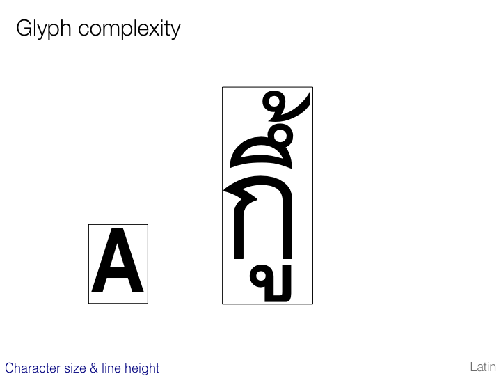
Most Thai characters require only around 7 pixels in width, although there are a small number that may require around twice that.

In height, however, Thai demands a minimum of 22 pixels (plus more inter-line spacing than is usual for Latin text).

slide

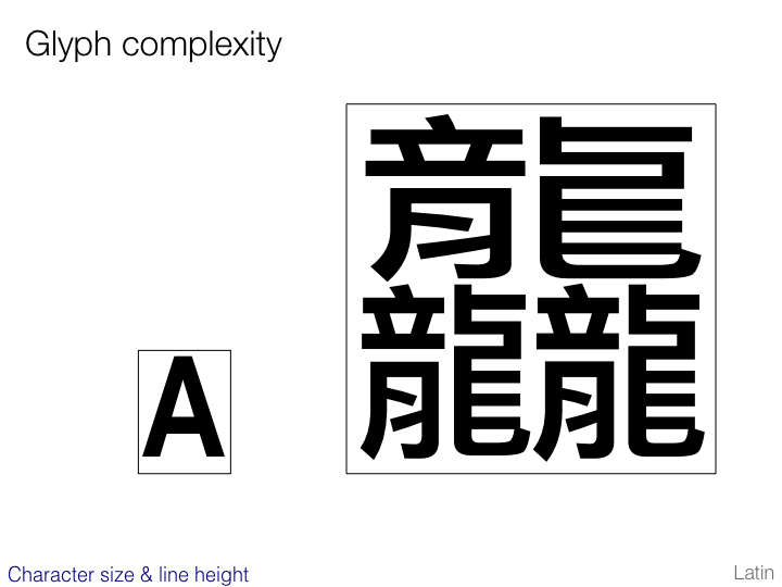
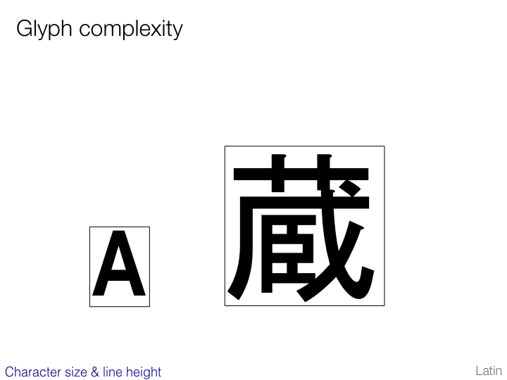
In Chinese (especially Traditional) there are many hundreds of characters that cannot be rendered in a16x16 pixel grid. An adequate size is likely to involve around 24x24 pixels. (Count the lines and spaces on the example on this slide and you will see that a minimal representation of this character requires more than that.)

 got to top of page

Line height & inter-line spacing

slide

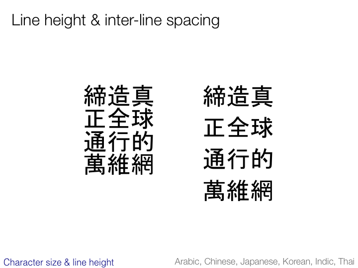
Even after supplying sufficient numbers of pixels to accommodate the complex shapes we have seen, many of these scripts demand additional inter-line spacing.

The example on the left of this slide shows what 16x16 pixel characters would look like without additional inter-line spacing. There are two issues here:

  1. the characters appear to run into each other and are difficult to read (especially if underlining is applied)

  2. it is not immediately apparent whether the text should be read vertically or horizontally.

Additional spacing as shown on the right alleviates both of these problems.

 got to top of page

Baseline alignment

slide

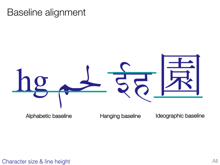
Another issue to be borne in mind concerns baseline alignment. The slide shows a number of possible types of baseline.

If using a font that includes more than one script this is not usually an issue since the font designer will normally ensure an appropriate match between baselines and character sizes for glyphs from different scripts. If, however, you are mixing scripts using different fonts, it is important to ensure that alignment is appropriate.

 got to top of page

Proportional spacing

slide

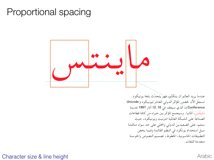
Whereas East Asian characters tend to use mono-spaced glyphs as the default, a script such as Arabic is extremely difficult to fit into a mono-spaced font. Arabic really demands proportionally-spaced glyphs.

In addition, scripts that use combining characters require the ability to overlap characters. This may cause significant problems for LCD panels.

 got to top of page

Indigenous typographic styles

This section gathers together a few additional typographic features that may differ across scripts. It is not exhaustive.

ruby

slide

The term ruby is used to refer to annotations typically occurring in East Asian scripts. In Japanese this is called furigana.

Furigana is typically used to provide phonetic transcriptions (in hiragana) of obscure characters, or characters that the reader is not expected to be familiar with. For example it is widely used in education materials and children’s texts.

Phonetic transcription normally appears above horizontal text. Sometimes semantic information is provided below the horizontal text.

slide

In vertical text, above equates to right, and below equates to left.

slide

Unicode provides special control characters that can be used to indicate what is ruby in plain text, as shown on the slide.

NOTE: these characters should not be used in a markup language such as HTML if a markup-based alternative is provided.

slide

Ruby annotation in Traditional Chinese uses bopomofo to indicate the pronunciation, and rather than appearing above the main text, the annotation is included vertically to the right of each character, whether the main text is vertical or horizontal.

 got to top of page

Emphasis

slide

This slide illustrates alternative, native Japanese, methods of emphasizing text. In the top example, small dots (called wakiten) are placed above the characters to be emphasized – one dot per character. (In vertical text they appear to the right of the character.)

The second example shows emphasis being indicated by the use of a light shaded box behind the relevant characters. This is called amikake.

Note also, as was mentioned earlier, that emphasis can be achieved in German by widening the spaces between characters.

slide

One style of Tibetan emphasis places small glyphs below a syllable, as shown in the slide. The glyph needs to be centred per the visible width of the syllable. In the cases on the slide, this looks possible by added a combining character to the stack, but in other syllables the position of the emphasis mark is not aligned with the stack, so actually it's placement varies according to the contents of the whole syllable.

 got to top of page

Italics

slide

Emphasis in Cyrillic is commonly achieved by italicization, as in Latin text, however italicization of Cyrillic typically changes certain glyphs in a systematic way. It cannot be achieved simply by distorting the non-italicized text slightly. Firstly, many characters adopt a more rounded shape.

slide

Other Cyrillic letters adopt a very different base shape during italicization.

 got to top of page

Kumimoji and warichu

slide

As an example of other typographic effects that may need to be supported, Japanese typography frequently uses approaches such as kumimoji and warichu.

Kumimoji (top line on the slide) refers to composites consisting of up to 5 characters that are reduced in size and combined to fit within the space of a single character. Such arrangements can be created as needed by the user if there is a capability to display the text correctly.

Warichu (bottom line on the slide) is a run of text of reduced font size that appears inside of a line of text as two lines of equal height and length.

(These examples and definitions are taken from the CSS3 Text Module.)

 got to top of page

Grid layout

slide

Note how, because all the characters above are mono-spaced and fit within the same sized box, the text on the slide gives the appearance of a grid. Grid layouts are actually a common typographic convention in East Asian scripts.

When half-width or proportionally-spaced characters are introduced, there is a possibility of this grid being corrupted, but typographic devices are available to provide several possible solutions to this.

 got to top of page

Counter styles

slide

Another typographic feature that varies from script to script and often from language to language is the numbering used for lists, chapter headings, etc. Not only are the counters likely to be based on characters of the script in question, but they may increment according to numeric, alphabetic or other rules. There are often more than one counter style per script/language. For more information about counter styles see Custom Counter Styles.

 got to top of page

Layout requirements work

slide

The W3C has a number of task forces working to identify gaps and define requirements for layout and typography in script around the world. You can follow or join these task forces if you want to contribute your expertise in a particular area.

The list of groups has grown since the slide was made, and includes the following at the time this tutorial was last updated:

  • Japanese
  • Korean
  • Chinese
  • Indic (Devanagari, Bengali, Tamil, Gujarati, Gurmukhi)
  • Tibetan
  • Arabic & Persian
  • Ethiopic
  • Southeast Asian (Khmer, Thai, Myanmar, Javanese, etc.)
  • Americas (Canadian Syllabics, Osage, Cherokee, etc.)
  • Africa (Adlam, N'Ko, etc.)

If you'd like to help improve support on the Web for a particular script, or if you'd simply like more information, see Language Enablement overview page.

 got to top of page

First published Feb 2003. This version 2021-12-10 17:44 GMT.  •  Copyright r12a@w3.org. Licence CC-By.