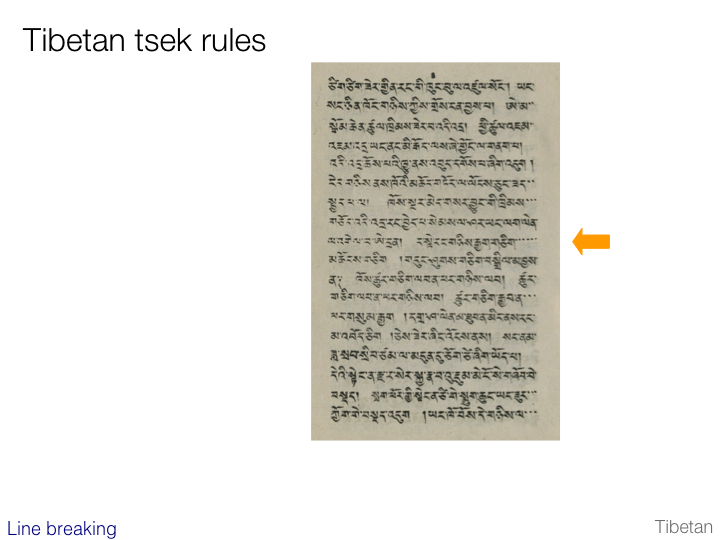
An Introduction to Writing Systems & Unicode

Word boundaries

Western

slide

It is not easy to determine what is meant by ‘word’. Typically people initially think of items in a sentence separated by spaces or certain types of punctuation. In languages such as German and Turkish, however, such runs of text can include a number of concepts run together.

This and the next few slides will consider in a very basic way the relevance of ‘words’ to some of the scripts in discussion here. For want of better terminology, we will use the term word in a general sense to mean a unit of meaning smaller than a phrase or sentence. We will also consider the highlighting behavior of Windows when you double-click in the middle of some text.

The example on this slide is Greek. Greek words are delimited by spaces. Typically double-clicking in Windows will highlight the text between spaces (and, depending on your settings, some space too).

 go to table of contents

Chinese

slide

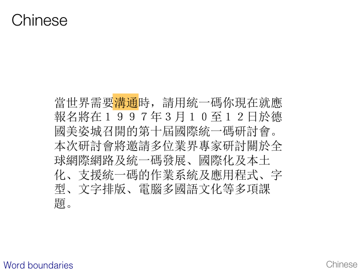
Chinese does not use spaces for word separation. Most ideographs have word-like meanings, although it is common for a sequence of characters to have a composite meaning derived from the individual parts.

Windows uses a dictionary lookup approach for double-click selection. The example on this slide was produced by double-clicking one of the two characters highlighted.

 go to table of contents

Japanese

slide

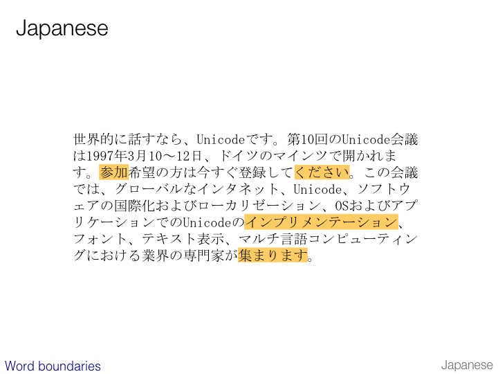
Japanese also makes no use of spaces for word separation. The apparent spacing in the example above is simply the lack of ink in the mono-spaced character cells.

The examples on this slide shows the effect of double-clicking in Windows in a number of different contexts. The first two show how Windows uses a dictionary-based approach to locate word boundaries within a run of kanji and hiragana text respectively. The third example is katakana text. The fourth example (at the bottom) highlights both the kanji and the hiragana that constitute an inflected word.

 go to table of contents

Korean

slide

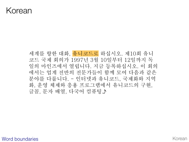
Korean does separate words with spaces.

Double-clicking works in the same way as the Greek example.

 go to table of contents

Thai

slide

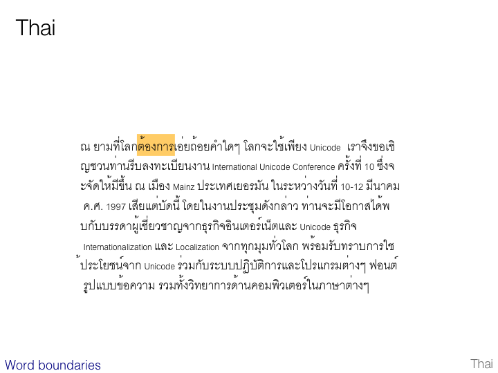
Thai uses spaces, but to separate phrases or sentences, not words. At the same time there is a fairly clear notion of where word boundaries fall.

Double-clicking on the text highlights one word at a time. Windows uses a dictionary-based approach to achieve this. Other applications may require the user to type in zero-width spaces after every word to make word detection and line breaking work.

 go to table of contents

Line breaking

Basic alternatives

slide

In this section we will look at line breaking. Justification often occurs at the same time, but we will examine it separately to keep the explanations simple.

Line breaking is typically word-based or character-based. Character-based line breaking usually involves the application of special character-specific rules.

slide

You can see how each script wraps by going to the the word wrap test page and changing the width of the browser window. It is impressive to see how, if all scripts are displayed together, each line wraps according to its own rules.

English, Greek, Hindi, and Russian text wraps whole words onto the next line.

Arabic and Hebrew do the same, but the text wraps to the right. Wrapping of embedded Latin text produces a special effect that will be described later.

Chinese, Japanese and Korean all wrap on a character by character basis, subject to the rules that will be described later. Korean is sometimes wrapped on a word basis, but it is more common these days to wrap on a character basis, despite the fact that Korean words are separated by spaces.

Thai is wrapped on a word basis, but a dictionary or other mechanism is needed to detect word boundaries, since they are not separated by spaces.

 go to table of contents

CJK line breaking rules

slide

This slide shows the rules for character-based line breaking that apply by default for Japanese in Office XP, minus the full vs. half width duplicates.

Similar rules apply to Chinese and Korean line breaking.

slide

The question arises, if Japanese and Chinese are typically grid-like in layout, what happens when a character such as a comma would by default appear at the beginning of a line as in the first example above.

Typically there are two possible approaches.

  1. the preceding character is pulled down to the next line

  2. the comma is left protruding into the margin.

These alternatives are illustrated in the lower level panels on the slide.

In fact there is another alternative if justification is available, but we will leave that for the next section.

 go to table of contents

Wrapping Latin text in Arabic & Hebrew

slide
slide

This slide shows the result of breaking a line in the middle of some Latin text in Arabic and Hebrew. The result is not immediately obvious for people unaccustomed to these scripts, as the order of words appears to be swapped.

This is because, although you can read in either direction horizontally, you are only expected to read down from one line to the next.

It is important to note that the order of characters in memory has NOT changed. This is purely rendering magic.

 go to table of contents

Hyphenation

slide

Latin and Cyrillic scripts allow hyphenation of words at the end of a line in order to achieve a better fit.

It is important to note that hyphenation rules differ from language to language within the same script. The slide shows hyphenation that is not permitted according to German orthographic rules.

slide

Unicode provides a soft-hyphen character (U+00AD SOFT HYPHEN) that can be used to control hyphenation. If the application displaying the text knows how to handle it, the hyphen will only be displayed if a word doesn't fit at the end of a line.

This is another kind of character that should be ignored when comparing strings, counting characters, ordering text, etc.

The slide shows some German text where the last word contains two soft hyphens. As the text size is increased the space available for the last word at the end of the line decreases, and the word is broken at the nearest hyphenation point, and the hyphen displayed.

 go to table of contents

Justification

Basic alternatives

slide

This slide lists possible approaches to justification. These include:

  • no justification,

  • adjusting the space between words,

  • adjusting the space between glyphs,

  • adjusting the baseline connection between joined glyphs.

In practice, justification will commonly involve adjustment of both word and glyph spacing at the same time.

slide

This slide shows an unjustified text.

slide

On this slide, justification has used inter-word spacing only. Note how the result is less than perfect, with large inter-word spaces on the second line, and no justification to the single word on the third line.

slide

In this third slide, both inter-word and inter-character spacing have been applied to the same text, and produce a much better result.

Note that justification does not only involve expansion. In fact it is common for a justification algorithm to attempt to reduce inter-word or inter-character spacing first, up to a certain limit, before expanding them.

Note also that expanding inter-character spaces in German will indicate to a German reader that the words are emphasized, not justified. So stretching inter-character spaces is uncommon in German text.

 go to table of contents

Justification in Chinese & Japanese

slide

This slide illustrates how justification can be used to remove the blank space at the end of the first line of text that we saw in the section about line breaking. The justification involves equally expanding the space between all characters on the first line.

Typically in character-based justification, rules are applied to different types of character in successive waves. For example, the algorithm may attempt to reduce the spacing around punctuation first, and only when more adjustment is needed turn to adjusting the spacing between ideographs.

In the section on line breaking we saw how punctuation can be left protruding into the right margin. Justification can also be used to draw this punctuation into the main body of text by reducing the inter-character spacing across the line.

 go to table of contents

Justification in Arabic

slide
slide

These two slides illustrate justification in Arabic based on extension of the baseline.

Note that this kind of baseline extension is also used for emphasising text in Arabic, for example in headings.

More sophisticated rendering algorithms produce this effect without adding additional characters to memory, and by stretching the baseline typographically. This can be referred to as kashida. Better quality applications also use additional techniques to stretch the text, such as replacing certain character glyphs with wider variants. They may also stretch interword spaces, and even the small spaces inside words where characters don't join to the left.

The very unsophisticated approach shown on the slide was copied from a newspaper where they had simply added baseline extension characters called tatweel (U+0640) to the text.

Whatever approach is used to elongate the words, there are rules about how much elongation is appropriate, and where it should occur. These rules also vary from type style to type style. For example, the rules for a naskh font will differ from those for a nasta'liq font. In fact, the ruq'a font style doesn't allow stretching at all.

 go to table of contents

slide

Another common approach to justification in Arabic script is to reduce the width of words, in order to produce a better fit. One way to achieve this is to use ligatures. Note how the (same) word in the example on the slide is much shorter where ligatures are used.

 go to table of contents

slide

Other scripts have different rules about how to do justification. The example on this slide shows how Tibetan may sometimes fill the remainder of the line with small tsek characters (syllable separators) – although, actually, the rules are a little more complicated than that, and some lines do not get filled with tseks while others do.

slide

This final example shows some Tamil text. Tamil words tend to be long, and in a narrow space, such as a newspaper column, it may not be possible to fit more than one word on a line. It is still desirable, however, to maintain a straight line down the left and right side of the column. To achieve this, Tamil may stretch the word to fill the line. Note how this spacing is achieved by spacing glyphs rather than code points: certain vowel-signs become separated from their base consonant, and a circumgraph around a base character involves two equal amounts of spacing.

First published Feb 2003. This version 2021-12-10 17:31 GMT.  •  Copyright r12a@w3.org. Licence CC-By.