I created a new HTML5-based template for our W3C Internationalization articles recently, and I’ve just received some requests to translate documents into Arabic and Hebrew, so I had to get around to updating the bidi style sheets. (To make it quicker to develop styles, I create the style sheet for ltr pages first, and only when that is working well do I create the rtl style sheet info.)

Here are some thoughts about how to deal with style sheets for both right-to-left (rtl) and left-to-right (ltr) documents.

What needs changing?

Converting a style sheet is a little more involved than using a global search and replace to convert left to right, and vice versa. While this may catch many of the things that need changing, it won’t catch all, and it could also introduce errors into the style sheet.

For example, I had selectors called .topleft and .bottomright in my style sheet. These, of course, shouldn’t be changed. There may also be occasional situations where you don’t want to change the direction of a particular block.

Another thing to look out for: I tend to use -left and -right a lot when setting things like margins, but where I have set something like margin: 1em 32% .5em 7.5%; you can’t just use search and replace, and you have to carefully scour the whole of the main stylesheet to find the instances where the right and left margins are not balanced.

There is a web service called CSSJanus that can apply a little intelligence to convert most of what you need. You still have to use with care, but it does come with a convention to prevent conversion of properties where needed (you can disable CSSJanus from running on an entire class or any rule within a class by prepending a /* @noflip */ comment before the rule(s) you want CSSJanus to ignore).

Note also that there are other things that may need changing besides the right and left values. For example, some of the graphics on our template need to be flipped (such as the dog-ear icon in the top corner of the page).

CSS may provide a way to do this in the future, but it is still only a proposal in a First Public Working Draft at the moment. (It would involve writing a selector such as #site-navigation:dir(rtl) { background-image: url(standards-corner-rtl.png); }.

Approach 1: extracting changed properties to an auxiliary style sheet

For the old template I have a secondary, bidi style sheet that I load after the main style sheet. This bidi style sheet contains a copy of just the rules in the main style sheet that needed changing and overwrites the styles in the main style sheet. These changes were mainly to margin, padding, and text-align properties, though there were also some others, such as positioning, background and border properties.

The cons of this approach were:

  1. it’s a pain to create and maintain a second style sheet in the first place
  2. it’s an even bigger pain to remember to copy any relevant changes in the main style sheet to the bidi style sheet, not least because the structure is different, and it’s a little harder to locate things
  3. everywhere that the main style sheet declared, say, a left margin without declaring a value for the right margin, you have to figure out what that other margin should be and add it to the bidi style sheet. For example, if a figure has just margin-left: 32%, that will be converted to margin-right: 32%, but because the bidi style sheet hasn’t overwritten the main style sheet’s margin-left value, the Arabic page will end up with both margins set to 32%, and a much thinner figure than desired. To prevent this, you need to figure out what all those missing values should be, which is typically not straightforward, and add them explicitly to the bidi style sheet.
  4. downloading a second style sheet and overwriting styles leads to higher bandwidth consumption and more processing work for the rtl pages.

Approach 2: copying the whole style sheet and making changes

This is the approach that I’m trying for the moment. Rather than painstakingly picking out just the lines that changed, I take a copy of the whole main style sheet, and load that with the article instead of the main style sheet. Of course, I still have to change all the lefts to rights, and vice versa, and change all the graphics, etc. But I don’t need to add additional rules in places where I previously only specified one side margin, padding, etc.

We’ll see how it works out. Of course, the big problem here is that any change I make to the main style sheet has to be copied to the bidi style sheet, whether it is related to direction or not. Editing in two places is definitely going to be a pain, and breaks the big advantage that style sheets usually give you of applying changes with a single edit. Hopefully, if I’m careful, CSSJanus will ease that pain a little.

Another significant advantage should be that the page loads faster, because you don’t have to download two style sheets and overwrite a good proportion of the main style sheet to display the page.

And finally, as long as I format things exactly the same way, by running a diff program I may be able to spot where I forgot to change things in a way that’s not possible with approach 1.

Approach 3: using :lang and a single file

On the face of it, this seems like a better approach. Basically you have a single style sheet, but when you have a pair of rules such as p { margin-right: 32%; margin-left: 7.5%;} you add another line that says p:lang(ar) { margin-left: 32%; margin-right: 7.5%; }.

For small style sheets, this would probably work fine, but in my case I see some cons with this approach, which is why I didn’t take it:

  1. there are so many places where these extra lines need to be added that it will make the style sheet much harder to read, and this is made worse because the p:lang(ar) in the example above would actually need to be p:lang(ar), p:lang(he), p:lang(ur), p:lang(fa), p:lang(dv) ..., which is getting very messy, but also significantly pumps up the bandwidth and processing requirements compared with approach 2 (and not only for rtl docs).
  2. you still have to add all those missing values we talked about in approach 1 that were not declared in the part of the style sheet dealing with ltr scripts
  3. the list of languages could be long, since there is no way to say “make this rule work for any language with a predominantly rtl script”, and obscures those rules that really are language specific, such as for font settings, that I’d like to be able to find quickly when maintaining the style sheet
  4. you really need to use the :lang() selector for this, and although it works on all recent versions of major browsers, it doesn’t work on, for example, IE6

Having said that, I may use this approach for the few things that CSSJanus can’t convert, such as flipping images. That will hopefully mean that I can produce the alternative stylesheet in approach 2 just by running through CSSJanus. (We’ll see if I’m right in the long run, but so far so good
)

Approach 4: what I’d really like to do

The cleanest way to reduce most of these problems would be to add some additional properties or values so that if you wanted to you could replace

p { margin-right: 32%; margin-left: 7.5%; text-align: left; }

with

p { margin-start: 32%; margin-end: 7.5%; text-align: start; }

Where start refers to the left for ltr documents and right for rtl docs. (And end is the converse.)

This would mean that that one rule would work for both ltr and rtl pages and I wouldn’t have to worry about most of the above.

The new properties have been strongly recommended to the CSS WG several times over recent years, but have been blocked mainly by people who fear that a proliferation of properties or values is confusing to users. There may be some issues to resolve with regards to the cascade, but I’ve never really understood why it’s so hard to use start and end. Nor have I met any users of RTL scripts (or vertical scripts, for that matter) who find using start and end more confusing than using right and left – in fact, on the contrary, the ones I have talked with are actively pushing for the introduction of start and end to make their life easier. But it seems we are currently still at an impasse.

text-align

Similarly, a start and end value for text-align would be very useful. In fact, such a value is in the CSS3 Text module and is already recognised by latest versions of Firefox, Safari and Chrome, but unfortunately not IE8 or Opera, so I can’t really use it yet.

In my style sheet, due to some bad design on my part, what I actually needed most of the time was a value that says “turn off justify and apply the current default” – ie. align the text to left or right depending on the current direction of the text. Unfortunately, I think that we have to wait for full support of the start and end values to do that. Applying text-align:left to unjustify, say, p elements in a particular context causes problems if some of those p elements are rtl and others ltr. This is because, unlike mirroring margins or padding, text-align is more closely associated with the text itself than with page geometry. (I resolved this by reworking the style sheet so that I don’t need to unjustify elements, but I ought to follow my own advice more in future, and avoid using text-align unless absolutely necessary.)

  1. Alan Gresley Says:

    Approach 4 is the most logical (no pun intended) way. It would also allowed for better styling with both LTR and RTL content together. Also *-start and *-end makes more sense in vertical writing-mode.

  2. Lensco Says:

    We went for a similar approach to 3 in the past: instead of using the lang pseudo-class we added an .rtl class to the body serverside. We also had presentational class names like .left and .right (for floats) and .tar and .tal (for text-align). Not ideal but it sort of worked. I agree that just having -start and -end would be very useful.

    Another variation could be achieved by using a CSS preprocessor like LESS or SASS. The output would be the same as approach 3, but authoring and maintenance could be simpler?

  3. Anas R. Says:

    I was planning to use ‘start’ and ‘end’ values for my CSS template, but I noticed that it still not supported in Opera.
    So I had to use ‘:lang’ with ALL ltr languages:
    http://beta.richstyle.org/demo-web-ar.php
    Also, the W3C CSS validator returned this warning:
    “value start only applies to XSL”!

  4. Mancko Says:

    When you can change the HTML code alongside the CSS, the more practical way is to set specific classes for each language direction, say for instance:

    #header-ltr {
    background:url(images/bg_top-ltr.jpg) no-repeat;
    }
    #header-rtl {
    background:url(images/bg_top-rtl.jpg) no-repeat;
    }

    You end up with quite a big bidi style sheet, but with some compression the total weight of the file is not much bigger than for only one language direction.
    Of course, it is way easier to start your project with language direction in mind than to change it afterwards.

  5. Anika Says:

    I personally use something similar to Approach 3, but depending on *dir* instead of *lang*. That way you only need to define one style per text direction. E.g.:

    [dir=rtl] th {
    text-align: right;
    }
    [dir=ltr] th {
    text-align: left;
    }

    The only con with that is that [dir] makes that declaration have a higher specificity.

In the phrase “ZusĂ€tzlich erleichtert PLS die Eingrenzung von Anwendungen, indem es Aussprachebelange von anderen Teilen der Anwendung abtrennt.” (“In addition, PLS facilitates the localization of applications by separating pronunciation concerns from other parts of the application.”) there are many long words. To fit these in narrow columns (coming soon to the Web via CSS) or on mobile devices, it would help to automatically hyphenate them.

Other major browsers already supported soft-hyphens when Firefox 5 implemented FF support. Soft hyphens provide a manual workaround for breaking long words, but more recently browsers such as Firefox, Safari and Chrome have begun to support the CSS3 hyphens property, with hyphenation dictionaries for a range of languages, to support (or disable, if needed) automatic hyphenation. (Note, however, that Aussprachebelange is incorrectly hyphenated in the example from Safari 5.1 on Lion OS shown above. It is hyphenated as Aussprac- hebelange. Some refinement is clearly still needed at this stage.)

For hyphenation to work correctly, the text must be marked up with language information, using the language tags described earlier. This is because hyphenation rules vary by language, not by script. The description of the hyphens property in CSS says “Correct automatic hyphenation requires a hyphenation resource appropriate to the language of the text being broken. The UA is therefore only required to automatically hyphenate text for which the author has declared a language (e.g. via HTML lang or XML xml:lang) and for which it has an appropriate hyphenation resource.”

This post is a place for me to dump a few URIs related to this topic, so that i can find them again later.

Hyphenation arrives in Firefox and Safari
http://blog.fontdeck.com/post/9037028497/hyphens

hyphens
https://developer.mozilla.org/en/CSS/hyphens#Gecko_notes
(lists languages to be supported by FF8)

Hyphenation on the web
http://www.gyford.com/phil/writing/2011/06/10/web-hyphenation.php

css text
http://www.gyford.com/phil/writing/2011/06/10/web-hyphenation.php

css generated content
http://dev.w3.org/csswg/css3-gcpm/#hyphenation

The html5 specification contains a bunch of new features to support bidirectional text in web pages. Language written with right-to-left scripts, such as Arabic, Hebrew, Persian, Thaana, Urdu, etc., commonly mixes in words or phrases in English or some other language that uses a left-to-right script. The result is called bidirectional or bidi text.

HTML 4.01 coupled with the Unicode Bidirectional algorithm already does a pretty good job of managing bidirectional text, but there are still some problems when dealing with embedded text from user input or from stored data.

The problem

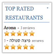
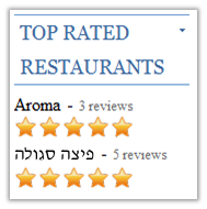
Here’s an example where the names of restaurants are added to a page from a database. This is the code, with the Hebrew shown using ASCII:

<p>Aroma - 3 reviews</p>
<p>PURPLE PIZZA - 5 reviews</p>

And here’s what you’d expect to see, and what you’d actually see.

AZZIP ELPRUP - 5 reviews

What it should look like.

5 - AZZIP ELPRUP reviews

What it actually looks like.


The problem arises because the browser thinks that the ” – 5″ is part of the Hebrew text. This is what the Unicode Bidi Algorithm tells it to do, and usually it is correct. Not here though.

So the question is how to fix it?

<bdi> to the rescue

The trick is to use the bdi element around the text to isolate it from its surrounding content. (bdi stands for ‘bidi-isolate’.)

<p><bdi>Aroma</bdi> - 3 reviews</p>
<p><bdi>PURPLE PIZZA</bdi> - 5 reviews</p>

The bidi algorithm now treats the Hebrew and “- 5” as separate chunks of content, and orders those chunks per the direction of the overall context, ie. from left-to-right here.

You’ll notice that the example above has bdi around the name Aroma too. Of course, you don’t actually need that, but it won’t do any harm. On the other hand, it means you can write a script in something like PHP that says:

foreach $restaurant echo "<bdi>$restaurant['name']</bdi> - $restaurant['reviews'] reviews"; 

This means you can handle any name that comes out of the database, whatever script it is in.

bdi isn’t supported fully by all browsers yet, but it’s coming.

Things to avoid

Using the dir attribute on a span element

You may think that something like this would work:

<p><span dir=rtl>PURPLE PIZZA</span> - 5 reviews</p>

But actually that won’t make any difference, because it doesn’t isolate the content of the span from what surrounds it.

Using Unicode control characters

You could actually produce the desired result in this case using U+200E LEFT-TO-RIGHT MARK just before the hyphen.

<p>PURPLE PIZZA &lrm;- 5 reviews</p>

For a number of reasons, however, it is better to use markup. Markup is part of the structure of the document, it avoids the need to add logic to the application to choose between LRM and RLM, and it doesn’t cause search failures like the Unicode characters sometimes do. Also, the markup can neatly deal with any unbalanced embedding controls inadvertently left in the embedded text.

Using CSS

CSS has also been updated to allow you to isolate text, but you should always use dedicated markup for bidi rather than CSS. This means that the information about the directionality of the document is preserved even in situations where the CSS is not available.

Using bdo

Although it sounds similar, and it’s used for bidi text too, the bdo element is very different. It overrides the bidi algorithm altogether for the text it contains, and doesn’t isolate its contents from the surrounding text.

Using the dir attribute with bdi

The dir attribute can be used on the bdi element to set the base direction. With simple strings of text like PURPLE PIZZA you don’t really need it, however if your bdi element contains text that is itself bidirectional you’ll want to indicate the base direction.

Until now, you could only set the dir attribute to ltr or rtl. The problem is that in a situation such as the one described above, where you are pulling strings from a database or user, you may not know which of these you need to use.

That’s why html5 has provided a new auto value for the dir attribute, and bdi comes with that set by default. The auto value tells the browser to look at the first strongly typed character in the element and work out from that what the base direction of the element should be. If it’s a Hebrew (or Arabic, etc.) character, the element will get a direction of rtl. If it’s, say, a Latin character, the direction will be ltr.

There are some rare corner cases where this may not give the desired outcome, but in the vast majority of cases it should produce the expected result.

Want another use case?

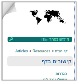
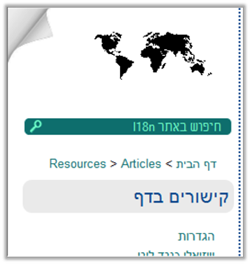
Here’s another situation where bdi can be useful. This time we are constructing multilingual breadcrumbs on the W3C i18n site. The page titles are generated by a script, and this page is in Hebrew, so the base direction is right-to-left.

Again here’s what you’d expect to see, and what you’d actually see.

Articles < Resources < WERBEH

What it should look like.

Resources < Articles < WERBEH

What it actually looks like.


Whereas in the previous example we were dealing with a number that was confused about its directionality, here we are dealing with a list of same script items in a base direction of the opposite direction.

If you wanted to generate markup that would produce the right ordering, whatever combination of titles was thrown at it, you could wrap each title in bdi elements.

Want more information?

The inclusion of these features has been championed by Aharon Lanin of Google within the W3C Internationalization (i18n) Working Group. He is the editor of a W3C Working Draft, Additional Requirements for Bidi in HTML, that tracks a range of proposals made to the HTML5 Working Group, giving rationales and recording resolutions. (The bdi element started out as a suggestion to include a ubi attribute.)

If you like more information on handling bidi in HTML in general, try Creating HTML Pages in Arabic, Hebrew and Other Right-to-left Scripts

And here’s the description of bdi in the HTML5 spec.

  1. HTML5 Semantics | Smashing Coding Says:

    [
] more comprehensible. For a further description of the problem and to see how bdi solves it, see “HTML5’s New bdi Element” by Richard Ishida, the W3C’s internationalization activity [
]

  2. HTML5 Semantics | BigDogStudio Says:

    [
] comprehensible. For a further description of the problem and to see how bdi solves it, see “HTML5’s New bdi Element” by Richard Ishida, the W3C’s internationalization activity [
]

  3. HTML5 ÙˆŰ§Ù„ÙˆÙŠŰš Ű§Ù„ŰŻÙ„Ű§Ù„ÙŠ | Ù…ŰŻÙˆÙ†Ű© ŰŻŰ±ÙˆŰł Ű§Ù„ÙˆÙŠŰš Says:

    [
] Ű§Ù„ŰȘي يقوم Ű§Ù„ŰčÙ†Ű”Ű± bdi ŰšŰ­Ù„Ù‡Ű§ ŰŁÙ„Ù‚ Ù†ŰžŰ±Ű© Űčلى Ù‡Ű°Ű§ Ű§Ù„Ù…Ù‚Ű§Ù„ HTML5’s New bdi Element Ù„ÙƒŰ§ŰȘŰšÙ‡ Richard Ishida Ű§Ù„Ù…ŰłŰ€ÙˆÙ„ Űčن Ű§Ù„ŰȘŰŻÙˆÙŠÙ„ Ù„ŰŻÙ‰ [
]

Picture of the page in action.

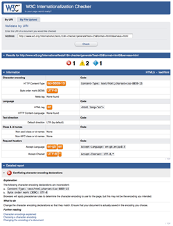
The ‘i18n checker’ is a free service by the W3C that provides information about internationalization-related aspects of your HTML page, and advice on how to improve your use of markup, where needed, to support the multilingual Web.

This latest release uses a new user interface and redesigned source code. It also adds a number of new tests, a file upload facility, and support for HTML5.

This is still a ‘pre-final’ release and development continues. There are already plans to add further tests and features, to translate the user interface, to add support for XHTML5 and polyglot documents, to integrate with the W3C Unicorn checker, and to add various other features. At this stage we are particularly interested in receiving user feedback.

Try the checker and let us know if you find any bugs or have any suggestions.

Picture of the page in action.

>> Use UniView

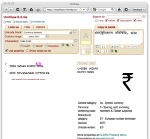
About the tool: Look up and see characters (using graphics or fonts) and property information, view whole character blocks or custom ranges, select characters to paste into your document, paste in and discover unknown characters, search for characters, do hex/dec/ncr conversions, highlight character types, etc. etc. Supports Unicode 6.0 and written with Web Standards to work on a variety of browsers. No need to install anything.

Latest changes: The majority of changes in this update relate to the user interface. They include the following:

  • Many controls have been grouped under three tabs: Look up, Filter, and Options. Various previously dispersed controls were gathered together under the Filter and Options tabs. Many of the controls have been slightly renamed.
  • The Search control has been moved to the top right of the window, where it is always visible.
  • The old Text Area is now a Copy & Paste control that has a 2-dimensional input box. In browser such as Safari, Chrome and Firefox 4, this box can be stretched by the user to whatever size is preferred.
  • The icon that provides a toggle switch between revealing detailed information for a character in a list or table, or copying that character to the Copy & Paste box has been redesigned. It stands alone and indicates the location of the current outcome using arrows.
    It looks like this: with the two arrows or this with the two arrows.
  • Title text has been provided for all controls, describing briefly what that control does. You can see this information by hovering over the control with the mouse.

Many of these changes were introduced to make it a little easier for newcomers to get to grips with UniView.

There were also some feature changes:

  • The ‘Codepoints’ control was converted to accept text as well as code points and renamed ‘Characters’. By default the control expect hex code point values, but this can be switched using the radio buttons. For text, you would usually use the ‘Copy & Paste’ control, but if you want to check out some characters without disturbing the contents of that control, you can now do so by setting the ‘Character’ radio button on the ‘Characters’ control.
  • The control to look up characters in the Unihan database the icon that looks like a Japanese character was fixed, but also extended to handle multiple characters at a time, opening a separate window for each character. (UniView warns you if you try to open more than 5 windows.)
  • The control to send characters to the Unicode Conversion tool the icon with overlapping boxes was fixed and now puts the character content of the field in the green box of the Converter Tool. If you need to convert hex or decimal code point values, do that in the converter.
  • The Show Age feature now works with lists, not just tables.

It has always been possible to pass a string to the converter in the URI, but that was never documented.

Now it is, and you can pass a string using the q parameter. For example, https://r12a.github.io/tools/conversion/?q=CrĂȘpes. You can also pass a string with escapes in it, but you will need to be especially careful to percent escape characters such as &, + and # which affect the URI syntax. For example, https://r12a.github.io/tools/conversion/?q=CrU%2B00EApes.

>> Use it

Inspired by some comments on John Well’s blog, I decided to add a keyboard layout to the IPA picker today. It follows the layout of Mark Huckvale’s Unicode Phonetic Keyboard (UCL) v1.01.

I can’t say I understand why many of the characters are allocated to the keys they are, but I figured that if John Wells uses this keyboard it would be probably worth using its layout.

Picture of the page in action.

>> Use it

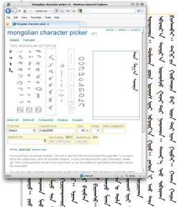
This picker contains characters from the Unicode Mongolian block needed for writing the Mongolian language. It doesn’t include Sibe, Todo or Manchu characters. Mongolian is a complex script, and I am still familiarising myself with it. This is an initial trial version of a Mongolian picker, and as people use it and raise feedback I may need to make changes.

About the tool: Pickers allow you to quickly create phrases in a script by clicking on Unicode characters arranged in a way that aids their identification. Pickers are likely to be most useful if you don’t know a script well enough to use the native keyboard. The arrangement of characters also makes it much more usable than a regular character map utility.

About this picker: The output area for this picker is set up for vertical text. However, only Internet Explorer currently supports vertical text display, and only IE8 supports Mongolian’s left-to-right column progression. In addition, it seems that IE doesn’t support ltr columns in textarea elements. The bottom line is that, although the output area is the right shape and position for vertical text, mostly the output will be horizontal. You will see vertical text in IE, but the column positions will look wrong. Nevertheless, in any of these cases, when you cut and paste text into another document, the characters will still be correctly ordered.

Consonants are to the left, and in the order listed in the Wikipedia article about Mongolian text. To their right are vowels, then punctuation, spaces and control characters, and number digits. The variation selectors are positioned just below the consonants.

As you mouse over the letters, the various combining forms appear in a column to the far left. This is to help identify characters, for those less familiar with the alphabet.

In this post I’m hoping to make clearer some of the concepts and issues surrounding jukugo ruby. If you don’t know what ruby is, see the article Ruby for a very quick introduction, or see Ruby Markup and Styling for a slightly longer introduction to how it was expected to work in XHTML and CSS.

You can find an explanation of jukugo ruby in Requirements for Japanese Text Layout, sections 3.3 Ruby and Emphasis Dots and Appendix F Positioning of Jukugo-ruby (you need to read both).

What is jukugo ruby?

Jukugo refers to a Japanese compound noun, ie. a word made up of more than one kanji character. We are going to be talking here about how to mark up these jukugo words with ruby.

There are three types of ruby behaviour.

Mono ruby is commonly used for phonetic annotation of text. In mono-ruby all the ruby text for a given character is positioned alongside a single base character, and doesn’t overlap adjacent base characters. Jukugo are often marked up using a mono-ruby approach. You can break a word that uses mono ruby at any point, and the ruby text just stays with the base character.

Group ruby is often used where phonetic annotations don’t map to discreet base characters, or for semantic glosses that span the whole base text. You can’t split text that is annotated with group ruby. It has to wrap a single unit onto the next line.

Jukugo ruby is a term that is used not to describe ruby annotations over jukugo text, but rather to describe ruby with a slightly different behaviour than mono or group ruby. Jukugo ruby behaves like mono ruby, in that there is a strong association between ruby text and individual base characters. This becomes clear when you split a word at the end of a line: you’ll see that the ruby text is split so that the ruby annotating a specific base character stays with that character. What’s different about jukugo ruby is that when the word is NOT split at the end of the line, there can be some significant amount of overlap of ruby text with adjacent base characters.

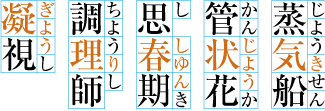
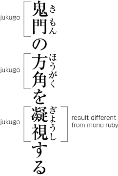
Example of ruby text.

The image to the right shows three examples of ruby annotating jukugo words.

In the top two examples, mono ruby can be used to produce the desired effect, since neither of the base characters are overlapped by ruby text that doesn’t relate to that character.

The third example is where we see the difference that is referred to as jukugo ruby. The first three ruby characters are associated with the first kanji character. Just the last ruby character is associated with the second kanji character. And yet the ruby text has been arranged evenly across both kanji characters.

Note, however, that we aren’t simply spreading the ruby over the whole word, as we would with group ruby. There are rules that apply, and in some cases gaps will appear. See the following examples of distribution of ruby text over jukugo words.

Various examples of jukugo ruby.

In the next part of this post I will look at some of the problems encountered when trying to use HTML and CSS for jukugo ruby.

If you want to discuss this or contribute thoughts, please do so on the public-i18n-cjk@w3.org list. You can see the archive and subscribe at http://lists.w3.org/Archives/Public/public-i18n-cjk/

Analyser: https://r12a.github.io/tools/analysestring/

Converter: https://r12a.github.io/tools/conversion/

The string analyser tool provides information about the characters in a string. One difference in this version is a new section “Data input as graphics”, where you see a horizontal sequence of graphics for each of the characters in the string you are analysing. This can be useful to get a screen snap of the characters. Of course, there is no combining or ligaturing behaviour involved – just a graphic per character.

You can reverse the character order for right-to-left scripts.

Another difference is that you can explode example text in the notes. Take this example: if you click on the Arabic word for Koran (red word near the bottom of the notes), you’ll see a pop-up window in the bottom right corner of the window that lists the characters in that word.

The other change is that the former “Related links” section in the sidebar is now called “Do more”, and the links carry the string you are analysing to the Converter or UniView apps.

Oh, and the page now remembers the options you set between refreshes, which makes life much easier.

The converter tool converts between characters and various escaped character formats. It was changed so that the “View names” button sends the characters to the string analyser tool. This means that you’ll now see graphics for the characters, and that, once on the string analyser page, you can change the amount of information displayed for each character (including showing font-based characters, if you need to).

I also fixed a bug related to the UTF-8 and UTF-16 input. Including spaces after the code values no longer fires off a bug.

PS: The string analyser tool has graphics for all new Unicode 6.0 characters, however I haven’t updated the data for those characters yet. I was planning to do so with the next release of UniView, which should be in October, when the final Unicode database is available.

https://r12a.github.io/scripts/indic-overview/

I finally got around to refreshing this article, by converting the Bengali, Malayalam and Oriya examples to Unicode text. Back when I first wrote the article, it was hard to find fonts for those scripts.

I also added a new feature: In the HTML version, click on any of the examples in indic text and a pop-up appears at the bottom right of the page, showing which characters the example is composed of. The pop-up lists the characters in order, with Unicode names, and shows the characters themselves as graphics.

I have not yet updated this article’s incarnation as Unicode Technical Note #10. The Indian Government also used this article, and made a number of small changes. I have yet to incorporate those, too.

I recently came across an email thread where people were trying to understand why they couldn’t see Indian content on their mobile phones. Here are some notes that may help to clarify the situation. They are not fully developed! Just rough jottings, but they may be of use.

Let’s assume, for the sake of an example, that the goal is to display a page in Hindi, which is written using the devanagari script. These principles, however, apply to one degree or another to all languages that use characters outside the ASCII range.

Let’s start by reviewing some fundamental concepts: character encodings and fonts. If you are familiar with these concepts, skip to the next heading.

Character encodings and fonts

Content is composed of a sequence of characters. Characters represent letters of the alphabet, punctuation, etc. But content is stored in a computer as a sequence of bytes, which are numeric values. Sometimes more than one byte is used to represent a single character. Like codes used in espionage, the way that the sequence of bytes is converted to characters depends on what key was used to encode the text. In this context, that key is called a character encoding.

There are many character encodings to choose from.

The person who created the content of the page you want to read should have used a character encoding that supports devanagari characters, but it should also be a character encoding that is widely recognised by browsers and available in editors. By far the best character encoding to use (for any language in the world) is called UTF-8.

UTF-8 is strongly recommended by the HTML5 draft specification.

There should be a character encoding declaration associated with the HTML code of your page to say what encoding was used. Otherwise the browser may not interpret the bytes correctly. It is also crucial that the text is actually stored in that encoding too. That means that the person creating the content must choose that encoding when they save the page from their editor. It’s not possible to change the encoding of text simply by changing the character encoding declaration in the HTML code, because the declaration is there just to indicate to the browser what key to use to get at the already encoded text.

It’s one thing for the browser to know how to interpret the bytes to represent your text, but the browser must also have a way to make those characters stored in memory appear on the screen.

A font is essential here. Fonts contain instructions for displaying a character or a sequence of characters so that you can read them. The visual representation of a character is called a glyph. The font converts characters to glyphs.

The font has tables to map the bytes in memory to text. To do this, the font needs to recognise the character encoding your page uses, and have the necessary tables to convert the characters to glyphs. It is important that the font used can work with the character encoding used in the page you want to view. Most fonts these days support UTF-8 encoded text.

Very simple fonts contain one glyph for each letter of the alphabet. This may work for English, but it wouldn’t work for a complex script such as devanagari. In these scripts the positioning and interaction of characters has to be modified according to the context in which they are displayed. This means that the font needs additional information about how to choose and postion glyphs depending on the context. That information may be built into the font itself, or the font may rely on information on your system.

Character encoding support

The browser needs to be able to recognise the character encoding used in order to correctly interpret the mapping between bytes and characters.

If the character encoding of the page is incorrectly declared, or not declared at all, there will be problems viewing the content. Typically, a browser allows the user to manually apply a particular encoding by selecting the encoding from the menu bar.

All browsers should support the UTF-8 character encoding.

Sometimes people use an encoding that is not designed for devanagari support with a font that produces the right glyphs nevertheless. Such approaches are fraught with issues and present poor interoperability on several levels. For example, the content can only be interpreted correctly by applying the specifically designed font; no other font will do if that font is not available. Also, the meaning of the text cannot be derived by machine processing, for web searches, etc., and the data cannot be easily copied or merged with other text (eg. to quote a sentence in another article that doesn’t use the same encoding). This practise seriously damages the openness of the Web and should be avoided at all costs.

System font support

Usually, a web page will rely on the operating system to provide a devanagari font. If there isn’t one, users won’t be able to see the Hindi text. The browser doesn’t supply the font, it picks it up from whatever platform the browser is running on.

If browser is running on a desktop computer, there may be a font already installed. If not, it should be possible to download free or commercial fonts and install them. If the user is viewing the page on a mobile device, it may currently be difficult to download and install one.

If there are several devanagari fonts on a system, the browser will usually pick one by default. However, if the web page uses CSS to apply styling to the page, the CSS code may specify one or more particular fonts to use for a given piece of content. If none of these are available on the system, most browsers will fall back to the default, however Internet Explorer will show square boxes instead.

Webfonts

Another way of getting a font onto the user’s system is to download it with the page, just like images are downloaded with the page. This is done using CSS code. The CSS code to do this has been defined for some years, but unfortunately most browsers implementation of this feature is still problematic.

Recently a number of major browsers have begun to support download of raw truetype or opentype fonts. Internet Explorer is not one of those. This involves simply loading the ordinary font onto a server and downloading to the browser when the page is displayed. Although the font may be cached as the user moves from page to page, there may still be some significant issues when dealing with complex scripts or Far Eastern languages (such as Chinese, Japanese and Korean) due to the size of the fonts used. The size of these fonts can often be counted in megabytes rather than kilobytes.

It is important to observe licencing restrictions when making fonts available for download in this way. The CSS mechanism doesn’t contain any restrictions related to font licences, but there are ways of preparing fonts for download that take into consideration some aspects of this issue – though not enough to provide a watertight restriction on font usage.

Microsoft makes available a program to create .eot fonts from ordinary true/opentype fonts. Eot font files can apply some usage restrictions and also subset the font to include only the characters used on the page. The subsetting feature is useful when only a small amount of text appears in a given font, but for a whole page in, say, devanagari script it is of little use – particularly if the user is to input text in forms. The biggest problem with .eot files, however, is that they are only supported by Internet Explorer, and there are no plans to support .eot format on other browsers.

The W3C is currently working on the WOFF format. Fonts converted to WOFF format can have some gentle protection with regard to use, and also apply significant compression to the font being downloaded. WOFF is currently only supported by Firefox, but all other major browsers are expected to provide support for the new format.

For this to work well, all browsers must support the same type of font download.

Beyond fonts

Complex scripts, such as those used for Indic and South East Asian languages, need to choose glyph shapes and positions and substitute ligatures, etc. according to the context in which characters are used. These adjustments can be acoomplished using the features of OpenType fonts. The browser must be able to implement those opentype features.

Often a font will also rely on operating system support for some subset of the complex script rendering. For example, a devanagari font may rely on the Windows uniscribe dll for things like positioning of left-appended vowel signs, rather than encoding that behaviour into the font itself. This reduces the size and complexity of the font, but exposes a problem when using that font on a variety of platforms. Unless the operating system can provide the same rendering support, the text will look only partially correct. Mobile devices must either provide something similar to uniscribe, or fonts used on the mobile device must include all needed rendering features.

Browsers that do font linking must also support the necessary opentype features and obtain functionality from the OS rendering support where needed.

If tools are developed to subset webfonts, the subsetting must not remove the rendering logic needed for correct display of the text.

  1. Gunnar Bittersmann Says:

    “By far the best character encoding to use (for any language in the world) is called UTF-8.”

    This is surely true for scripts using characters with codepoints below U+0800. However, a CJK character takes 3 bytes in UTF-8, but only 2 bytes in UTF-16, so UTF-8 might not always be the best option for _any_ language.

    Of course, the context here is Web pages, where the markup syntax adds Basic Latin characters (1 byte in UTF-8, 2 bytes in UTF-16). This shifts the balance even for pages in Far Eastern languages towards UTF-8.

    BTW, there’s a typo: acoomplished

  2. Steve Bratt Says:

    Richard 


    A very helpful summary of the complex language support ecosystem. The Web Foundation is interested in raising awareness of these challenges, and doing what we can to make it easier for more people to author and read in more languages.

    Have you found any good references that summarize the challenges faced by, say, the worlds 500 (or whatever) most spoken or most read languages?

    I look forward to working with you on these issues.

    Steve

  3. r12a Says:

    @Steve, I don’t know of a single, comprehensive source that describes the technical issues on the ground, such as what is/isn’t supported by what platform, though it would certainly be interesting to work on such a thing.

    Some information can be gleaned from Don Osborne’s new book “African Languages in a Digital Age” and the reports by the PAN Localization project in Asia.

    However, for a pretty good overview of the basic features of the main scripts in use around the world (which is a good starting point), come and see my tutorial at the Unicode Conference in October, or read the online text at https://r12a.github.io/docs/unicode-tutorial/

  4. r12a Says:

    Along those lines, people may be interested in my quick and dirty, rule-of-thumb guide to Script Features by Language at https://r12a.github.io/scripts/featurelist/

Picture of the page in action.

>> Use it

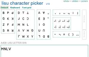
In 1992 the Chinese government recognised the Fraser alphabet as the official script for the Lisu language and has encouraged its use since then. There are 630,000 Lisu people in China, mainly in the regions of Nujiang, Diqing, Lijiang, Dehong, Baoshan, Kunming and Chuxiong in the Yunnan Province. Another 350,000 Lisu live in Myanmar, Thailand and India. Other user communities are mostly Christians from the Dulong, the Nu and the Bai nationalities in China.

About the tool: Pickers allow you to quickly create phrases in a script by clicking on Unicode characters arranged in a way that aids their identification. Pickers are likely to be most useful if you don’t know a script well enough to use the native keyboard. The arrangement of characters also makes it much more usable than a regular character map utility.

Latest changes: This picker is new. The default view was modified from an original proposal by Benjamin Lee, and is likely to be more useful to people who are somewhat familiar with the alphabet and characters of Lisu. Characters are arranged to simplify entry, with consonants to the left, vowels to their right, and tone marks to their right.

There is also a keyboard view. Many of the positions of characters are based on keyboard layouts I have seen. Those keyboards, however, tended to use some ASCII characters for punctuation, when the Unicode Standard recommends other characters (in particular, MODIFIER LETTER LOW MACRON and MODIFIER LETTER APOSTROPHE) or omit some punctuation characters mentioned in the Unicode Standard. The current version of this keyboard, therefore adds some extra characters.

The layout is adequate, given that pickers assume availability of a QWERTY keyboard, however if a real standardised keyboard layout is to be made, it should involve some further changes. For example, people wanting to use syntax characters such as comma, period, semi-colon, single quote, etc, while writing the text in Lisu will need direct access to those characters. They are missing from this layout.

Picture of the page in action.

>> Use UniView lite

>> Use UniView

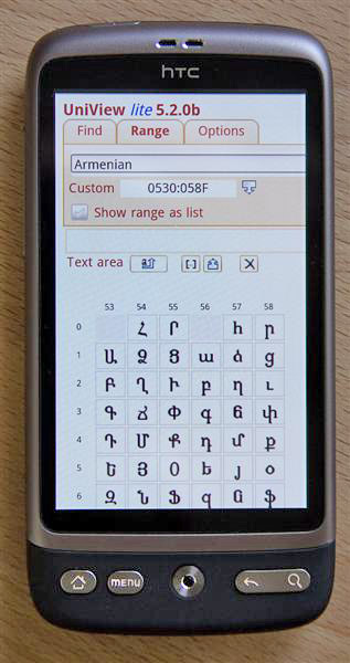
About the tool: Look up and see characters (using graphics or fonts) and property information, view whole character blocks or custom ranges, select characters to paste into your document, paste in and discover unknown characters, search for characters, do hex/dec/ncr conversions, highlight character types, etc. etc. Supports Unicode 5.2 and written with Web Standards to work on a variety of browsers. No need to install anything.

Latest changes: The major change in this update is the addition of an alternative UniView lite interface for the tool that makes it easier to use UniView in restricted screen sizes, such as on mobile devices. The lite interface offers a subset of the functionality provided in the full version, rearranges the user interface and sets up some different defaults (eg. list view is the default, rather than the matrix view). However, the underlying code is the same – only the initial markup and the CSS are different.

Another significant change is that when you click on a character in a list or matrix that character is either added to the text area or detailed information for that character is displayed, but not now both at the same time. You switch between the two possibilities by clicking on the icon. When the background is white (default) details are shown for the character. When the background is orange the character will be added to the text area (like a character map or picker).

Information from my character database is now shown by default when you are shown detailed information for a character. The switch to disable this has been moved to the Options panel.

Text highlighted in red in information from the character database contains examples. In case you don’t have a font for viewing such examples, or in case you just want to better understand the component characters, you can now click on these and the component characters will be listed in a new window (using the String Analyzer tool).

Access to Settings panel has been moved slightly downwards and renamed Options in the full version.

The default order for items in lists is now <character><codepoint><name>, rather than the previous <codepoint><character><name>. This can still be changed in the Options panel, or by setting query parameters.

I changed the Next and Previous functions in the character detail pane so that it moves one codepoint at a time through the Unicode encoding space. The controls are now buttons rather than images.

About the tool: Pickers allow you to quickly create phrases in a script by clicking on Unicode characters arranged in a way that aids their identification. Pickers are likely to be most useful if you don’t know a script well enough to use the native keyboard. The arrangement of characters also makes it much more useable than a regular character map utility.

Latest changes: This picker has been upgraded to use the version 10 look and feel, and incorporate new characters from Unicode version 5.2. Characters whose use is discouraged in Unicode have been moved to the advanced section – similar looking images in the main section put multiple characters into the output, as per NFC normalization.

>> Use it

About the tool: Pickers allow you to quickly create phrases in a script by clicking on Unicode characters arranged in a way that aids their identification. Pickers are likely to be most useful if you don’t know a script well enough to use the native keyboard. The arrangement of characters also makes it much more useable than a regular character map utility.

Latest changes: Both pickers have been upgraded to use the version 10 look and feel.

The Arabic block picker now includes the latest characters added to the Arabic and Arabic Supplement blocks in Unicode 5.1. Characters are displayed using the shape view of version 10 pickers. This saves a lot of space on-screen.

The Ethiopic picker was also updated to include more recent characters from the Unicode Ethiopic block (added in version 4.1), and the layout was improved to make it easier to locate a character. It still covers only the basic Ethiopic block.

>> Use the Arabic Block picker

>> Use the Ethiopic picker

The new characters.

About the tool: Pickers allow you to quickly create phrases in a script by clicking on Unicode characters arranged in a way that aids their identification. Pickers are likely to be most useful if you don’t know a script well enough to use the native keyboard. The arrangement of characters also makes it much more useable than a regular character map utility

Latest changes: I recently added U+2C71 LATIN SMALL LETTER V WITH RIGHT HOOK (labiodental tap or flap) to the IPA picker. This was in the IPA chart for a long time, but was only added to Unicode in version 5.1.

Today I also added, at the request of Dan McCloy, four prosodic markers: prosodic phrase, prosodic word, syllable and mora (see the second line of the picture).

Regular users will also notice that I recently upgraded the picker chrome to version 10, too.

>> Use it