Picture of Tibetan emphasis.

Christopher Fynn of the National Library of Bhutan raised an interesting question on the W3C Style and I18n lists. Tibetan emphasis is often achieved using one of two small marks below a Tibetan syllable, a little like Japanese wakiten. The picture shows U+0F35: TIBETAN MARK NGAS BZUNG NYI ZLA in use. The other form is 0F37: TIBETAN MARK NGAS BZUNG SGOR RTAGS.

Chris was arguing that using CSS, rather than Unicode characters, to render these marks could be useful because:

  • the mark applies to, and is centred below a whole ā€˜syllableā€™ ā€“ not just the stack of the syllable ā€“ this may be easier to achieve with styling than font positioning where, say, a syllable has an even number of head characters (see examples to the far right in the picture)
  • it would make it easier to search for text if these characters were not interspersed in it
  • it would allow for flexibility in approaches to the visual style used for emphasis ā€“ you would be able to change between using these marks or alternatives such as use of red colour or changes in font size just by changing the CSS style sheet (as we can for English text).

There are of potential issues with this approach too. These include things like the fact that the horizontal centring of glyphs within the syllable is not trivial. The vertical placement is also particularly difficult. You will notice from the attached image that the height depends on the depth of the text it falls below. On the other hand, it isnā€™t easy to achieve this with diacritics either, given the number of possible permutations of characters in a syllable. Such positioning is much more complicated than that of the Japanese wakiten.

A bigger issue may turn out to be that the application for this is fairly limited, and user agent developers have other priorities ā€“ at least for commercial applications.

To follow along with, and perhaps contribute to, the discussion follow the thread on the style list or the www-international list.

UPDATE: This post has now been updated, reviewed and released as a W3C article. See http://www.w3.org/International/questions/qa-personal-names.

People who create web forms, databases, or ontologies in English-speaking countries are often unaware how different peopleā€™s names can be in other countries. They build their forms or databases in a way that assumes too much on the part of foreign users.

Iā€™m going to explore some of the potential issues in a series of blog posts. This content will probably go through a number of changes before settling down to something like a final form. Consider it more like a set of wiki pages than a typical blog post.

Scenarios

A form that asks for your name in a single field.
A form that asks for separate first and last names.

It seems to me that there are a couple of key scenarios to consider.

A You are designing a form in a single language (letā€™s assume English) that people from around the world will be filling in.

B You are designing a form in a one language but the form will be adapted to suit the cultural differences of a given locale when the site is translated.

In reality, you will probably not be able to localise for every different culture, so even if you rely on approach B, some people will still use a form that is not intended specifically for their culture.

Examples of differences

To get started, letā€™s look at some examples of how peopleā€™s names are different around the world.

Given name and patronymic

In the name Bjƶrk GuĆ°mundsdĆ³ttir Bjƶrk is the given name. The second part of the name indicates the fatherā€™s (or sometimes the motherā€™s) name, followed by -sson for a male and -sdĆ³ttir for a female, and is more of a description than a family name in the Western sense. Bjƶrkā€™s father, GuĆ°mundor, was the son of Gunnar, so is known as GuĆ°mundur Gunnarsson.

Icelanders prefer to be called by their given name (Bjƶrk), or by their full name (Bjƶrk GuĆ°mundsdĆ³ttir). Bjƶrk wouldnā€™t normally expect to be called Ms. GuĆ°mundsdĆ³ttir. Telephone directories in Iceland are sorted by given name.

Other cultures where a person has one given name followed by a patronymic include parts of Southern India, Malaysia and Indonesia.

Different order of parts

In the name ęÆ›ę³½äøœ [mao ze dong] the family name is Mao, ie. the first name, left to right. The given name is Dong. The middle character, Ze, is a generational name, and is common to all his siblings (such as his brothers and sister, ęÆ›ę³½ę°‘ [mao ze min], ęÆ›ę³½č¦ƒ [mao ze tan], and ęÆ›ę¾¤ē“… [mao ze hong]).

Among acquaintances Mao may be referred to as ęÆ›ę³½äøœå…ˆē”Ÿ [mao ze dong xiān shēng] or ęƛ先ē”Ÿ [mao xiān shēng]. Not everyone uses generational names these days, especially in Mainland China. If you are on familiar terms with someone called ęÆ›ę³½äøœ, you would normally refer to them using ę³½äøœ [ze dong], not just äøœ [dong].

Note also that the names are not separated by spaces.

The order family name followed by given name(s) is common in other countries, such as Japan, Korea and Hungary.

Chinese people who deal with Westerners will often adopt an additional given name that is easier for Westerners to use. For example, Yao Ming (family name Yao, given name Ming) may write his name for foreigners as Fred Yao Ming or Fred Ming Yao.

Multiple family names

Spanish-speaking people will commonly have two family names. For example, Maria-Jose CarreƱo QuiƱones may be the daughter of Antonio CarreƱo Rodrƭguez and Marƭa QuiƱones MarquƩs.

You would refer to her as SeƱorita CarreƱo, not SeƱorita QuiƱones.

Variant forms

We already saw that the patronymic in Iceland ends in -son or -dĆ³ttir, depending on whether the child is male or female. Russians use patronymics as their middle name but also use family names, in the order given-patronymic-family. The endings of the patronymic and family names will indicate whether the person in question is male or female. For example, the wife of Š‘Š¾Ń€Šøс ŠŠøŠŗŠ¾Š»Š°ĢŠµŠ²Šøч Š•Š»ŃŒŃ†ŠøŠ½ (Boris Nikolayevich Yeltsin) is ŠŠ°ŠøŠ½Š° Š˜Š¾ŃŠøфŠ¾Š²Š½Š° Š•Š»ŃŒŃ†ŠøŠ½Š° (Naina Iosifovna Yeltsina) ā€“ note how the husbandā€™s names end in consosonants, while the wifeā€™s names (even the patronymic from her father) end in a.

Mixing it up

Many cultures mix and match these differences from Western personal names, and add their own novelties.

For example, Velikkakathu Sankaran Achuthanandan is a Kerala name from Southern India, usually written V. S. Achuthanandan which follows the order familyName-fathersName-givenName. In many parts of the world, parts of names are derived from titles, locations, genealogical information, caste, religious references, and so on, eg. the Arabic Abu Karim Muhammad al-Jamil ibn Nidal ibn Abdulaziz al-Filistini.

In Vietnam, names such as Nguyį»…n Tįŗ„n DÅ©ng follow the order family-middle-given name. Although this seems similar to the Chinese example above, even in a formal situation this Prime Minister of Vietnam is referred to using his given name, ie. Mr. Dung, not Mr. Nguyen.

Further reading

Wikipedia sports a large number of fascinating articles about how peopleā€™s names look in various cultures around the world. I strongly recommend a perusal of the follow links.

Akan ā€¢ Arabic ā€¢ Balinese ā€¢ Bulgarian ā€¢ Czech ā€¢ Chinese ā€¢ Dutch ā€¢ Fijian ā€¢ French ā€¢ German ā€¢ Hawaiian ā€¢ Hebrew ā€¢ Hungarian ā€¢ Icelandic ā€¢ Indian ā€¢ Indonesian ā€¢ Irish ā€¢ Italian ā€¢ Japanese ā€¢ Javanese ā€¢ Korean ā€¢ Lithuanian ā€¢ Malaysian ā€¢ Mongolian ā€¢ Persian ā€¢ Philippine ā€¢ Polish ā€¢ Portuguese ā€¢ Russian ā€¢ Spanish ā€¢ Taiwanese ā€¢ Thai ā€¢ Vietnamese

Consequences

If designing a form or database that will accept names from people with a variety of backgrounds, you should ask yourself whether you really need to have separate fields for given name and family name.

This will depend on what you need to do with the data, but obviously it will be simpler to just use the full name as the user provides it, where possible.

Note that if you have separate fields because you want to use the personā€™s given name to communicate with them, you may not only have problems due to name syntax, but there are varying expectations around the world with regards to formality also that need to be accounted for. It may be better to ask separately, when setting up a profile for example, how that person would like you to address them.

If you do still feel you need to ask for constituent parts of a name separately, try to avoid using the labels ā€˜first nameā€™ and ā€˜last nameā€™, since these can be confusing for people who normally write their family name followed by given names.

Be careful, also, about assumptions built into algorithms that pull out the parts of a name automatically. For example, the v-card and h-card approach of implied ā€œnā€ optimization could have difficulties with, say, Chinese names. You should be as clear as possible about telling people how to specify their name so that you capture the data you think you need.

If you are designing forms that will be localised on a per culture basis, donā€™t forget that atomised name parts may still need to be stored in a central database, which therefore needs to be able to represent all the various complexities that you dealt with by relegating the form design to the localisation effort.

Iā€™ll post some further issues and thoughts about personal names when time allows.

[See part 2.]

This morning I came across an interesting set of principles for site design. It was developed as part of the BBC 2.0 project.

That led me to the BBC Director Generalā€™s ā€œBBC 2.0: why on demand changes everythingā€œ. Also a very interesting read as a case study for the web as part of a medium of mass communication.

One particular topic out of several I found of interest:

Interestingly, on July 7th last year, which was by far the biggest day yet for the use of rich audio-visual content from our news site, the content most frequently demanded was the eyewitness user generated content (UGC) from the bomb scenes.

Shaky, blurry images uploaded by one member of the public, downloaded by hundreds of thousands of other members of the public.

Itā€™s a harbinger of a very different, more collaborative, more involving kind of news.

Here, as at so many other points in the digital revolution, the public are moving very quickly now ā€“ at least as quickly as the broadcasters.

I also find it interesting to see how news spreads through channels like Flickr. Eighteen months ago we were mysteriously bounced out of bed at 6am, but there was nothing on the TV to explain what had happened. I went up to the roof patio and took some of the first photos of the Buncefield explosion, including a photo taken just 20 minutes after the blast, and uploaded it to Flickr. A slightly later photo hit the number one spot for interestingness for that day. And as many other peopleā€™s photos appeared it was possible to get a lot of information, even ahead of the national news, including eye witness accounts, about what had happened.

Over the past 24 hours Iā€™ve been exploring with interest the localization of the Flickr UI.

One difference youā€™ll notice, if you switch to a language other than English, is that the icons above a photo such as on this page have no text in them.

I checked with Flickr staff, and they confirmed that this is because of the difficulty of squeezing in the translated text in the space available. A classic localization issue, and one that developers and designers should always consider when designing the UI.

For example, hereā€™s the relevant part of the English UI:

Picture of the English version, with text embedded in graphics.

and here is what it looks like when using the Spanish (or indeed any other) UI:

Picture of the Spanish version with only icons, no text.

The text has been dropped in favour of just icons. Note, however, how the text appears in the tooltips that pop up as you mouse over the icons.

This can be an effective way of addressing the problems of text expansion during translation, as long as the icons are understandable memorable and free from cultural bias or offense. Using the tooltips to clarify the meaning is useful too. I think these icons work well, and Iā€™d actually like the Flickr folks to make the English version look like this, too. It detracts less from the photos, to my mind.

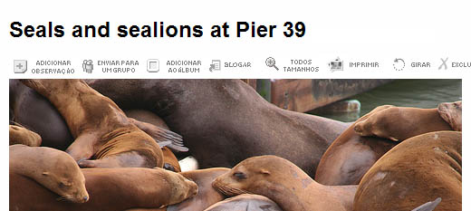
Hereā€™s what it may have looked like if Flickr had done the Portuguese in the same way as the English:

Picture of a hypothetical Portuguese version with text in the graphics.

There are a number of problems here. The text is quite dense, it overshoots the width of the photo (there are actually still two letters missing on the right), and it is quite hard to see the accented characters. The text would have to be in a much bigger font to support the complexity of the characters in Chinese and Korean (and of course many other future languages).

Of course, in many situations where text appears in graphics the available width for the text is seriously fixed, and usually within a space that just about fits the English (if thatā€™s the source).

Text will usually expand when translating from English, in particular. This expansion can be particularly pronounced for short pieces of text like icon labels.

So the moral of this story: Think several times before using text in graphics, and in particular icons. If you need to localise your page later, you could have problems. Better just avoid it from the start if you can.

View blog reactions

>> Use it !

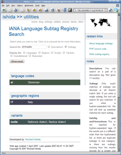
Picture of the page in action.

This tool allows you to search for subtags that have, say, ā€˜frenchā€™ in their description (there are currently 11), or to find out what that mysterious ā€˜chā€™ subtag stands for (there are 2 possibilities).

Update: You can now also search for a hyphen-separated sequences of subtags, such as sl-IT-nedis and find out what each of the component subtags mean.

Alternatively, you can simply list all current language tags, or script tags, or variants, etc.

For months Iā€™ve been wanting to write a small, Web-based tool for finding things in the subtag registry without having to work on the (for many people, intimidating) raw text file on the IANA site.

Tom Gruner created an initial tool for pretty printing the IANA list, which handled enough of the basics to allow me to use the little time I have these days to add the search functionality on top.

If you have JavaScript running, you are shown just the tags and descriptions initially, but by clicking on those you can reveal all additional information in the registry for a given tag. I also highlight tags that are deprecated, so you can see that straight away.

(PS: Some final tweaks to the code will come when I have a spare moment for things like making the expanding list more accessible, etc.)

This post was updated. See bottom of post for details.

I developed a set of JavaScript routines (W3C DOM standard) for hiding and revealing information on a page that you should be able to plug in to a wide range of content. Please feel free to use the code (though an acknowledgement would be nice.)

Files
JavaScript: expandcollapse.js

CSS: expandcollapsestyle.css
Original HTML: news.html
Resulting HTML: newsWithJS.html

The uncollapsed text. (Click to see larger version.)

Weā€™ll illustrate how to apply this with an example. The picture shows what it looks like initially. (View the HTML.) Weā€™ll collapse the additional news after the first item to just the headlines, but allow you to reveal the detail by clicking or tabbing and hitting return.

[I applied this to a hacked down version of someone elseā€™s page, because I was short on time. This is good, in that it shows that itā€™s easy to apply this to existing pages. However, due to my hacking, the general markup of the page may look a little strange in parts. Please ignore that.]

Structuring the content

The markup of content you want to hide and reveal may be structured in a number of ways. This approach assumes that:

  1. you will click on a block element (which we will call the trigger) to cause some content below it to expand or contract
  2. the content revealed/hidden by clicking on the trigger can be in any number of block elements of any type. (You can also include other block elements above the trigger, if you like, though they wonā€™t be hidden.)
  3. each trigger and its revealable content is bounded by a block element. (We will use a div, but it could be any block element.)
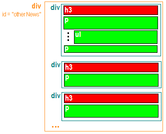
  4. all the expanding and collapsing content is surrounded by another element with an id. This allows you to work with expanding content in different areas on the same page separately. (Again we use a div, with the id otherNews, but the id could just as easily be on the body element, since we only have one area of affected content on this page.)

The diagram below shows the arrangement used in the example file. The trigger element is red. The content to be hidden/revealed is green. You donā€™t have to use an h3 as the trigger. You could even use an ordinary paragraph tag. If you do, however, you should use a class name on each trigger element, so that the trigger can be identified.

Note that the trigger element should not contain an <a> element, since the JavaScript will add an <a> element to create a clickable zone. (It doesnā€™t make sense, anyway.)

The structure of the content in the example.

Setting up the markup

Very little change is required to the markup.

What I did

Add this to the document head:
<script src="expandcollapse.js"></script>
<link rel="stylesheet" href="expandcollapsestyle.css"/>

Add this to the body element start tag:
onload="setCollapseExpand('otherNews', 'h3','');revealControl('On'); revealControl('Off');"

Add this next to the RSS icon, just above the expanding content:
<a id="On" name="On" onclick="openAll('otherNews', 'h3','');" href="#_" class="hideIfNoJS">Open All</a>
<a id="Off" name="Off" onclick="closeAll('otherNews', 'h3','');" href="#_" class="hideIfNoJS">Close All</a>

Notes:

  1. onload="setCollapseExpand('otherNews', 'h3','');"

    After the document has loaded, this collapses the content.

    The JavaScript will look through the div with id otherNews for all h3 elements. It then finds the parent of the h3 element, and adds a class name to all the remaining elements after the h3 within that parent (a div, in our case). The class is associated with styling that makes these elements disappear. It will also surround the contents of the h3 element with an a element. This allows keyboard users to access the functionality using tabs. Each a element is given an onclick function to enable it to toggle the hidden content on or off.

    If we had wanted to use an ordinary p tag with a class name of, say, trigger rather than the h3, the onload code would look like this:

    onload="setCollapseExpand('otherNews', 'p','trigger');"
  2. Optional. You may want to add some buttons to expand and collapse all text in one go. If so youā€™ll need to add these to the markup. In our example I added the following code alongside the RSS feed icon. I used an a element so that keyboard users can tab to it.

    <a id="On" name="On" onclick="openAll('otherNews', 'h3','');" 
       href="#_" class="hideIfNoJS">Open All</a>
    <a id="Off" name="Off" onclick="closeAll('otherNews', 'h3','');" 
       href="#_" class="hideIfNoJS">Close All</a>
    

    I added the class name hideIfNoJS to each a element. We can now use CSS to hide this text unless JavaScript is detected.

    We then need to add two more statements to the onload value on the body tag, one for each a element.

    revealControl('On'); revealControl('Off');

    After the document loads, the JavaScript will remove those class names, and the switches will become visible.

  3. <link rel="stylesheet" href="expandcollapsestyle.css"/>

    CSS will drive most of the behaviour. The JavaScript simply changes the class names associated with the markup. This references a stylesheet that will do all the hard lifting.

A walk through the CSS

Letā€™s take a look at the CSS in the expandcollapsestyle.css file.

First, we add some styling to the new ā€˜Open Allā€™ and ā€˜Close Allā€™ text we added. This will make this text look like small graphical buttons, and change the cursor to a pointing hand as we mouse over them.

   a#On, a#Off {
      padding: 0.1em 0.5em 0.1em 0.5em;
      margin: 0 0.5em 0 0;
      text-decoration: none;
      background: #005a9c;
      color: #fc6;
      font-weight: bold;
      cursor: pointer;
      }

Next, we add a rule to remove the ā€˜Open Allā€™ and ā€˜Close Allā€™ buttons from view initially. The revealControl calls in the body onload attribute will remove this class if JavaScript is enabled.

   .hideIfNoJS {
      display: none;
      }

Now, we style the trigger text (in our case the h3 elements).

The first set of rules makes the cursor become a pointer when we mouse over the text, and adds a graphic to show whether the content is revealed or not.

   .triggerOpen {
	background:url(http://www.w3.org/International/icons/open-thin.gif)
              no-repeat left 2px #fffaf0;
	}

   .triggerClosed {
	background:url(http://www.w3.org/International/icons/close-thin.gif)
              no-repeat left 2px #fffaf0;
	}

You can, of course, change the styling to suit yourself. For example, you may want to use a different graphic.

We also fix the colour of the trigger text, pads the left side of the text so that you can see the graphic, and make the trigger change colour as you mouse over it. (Note that the JavaScript has introduced this a element.)

.triggerOpen a, .triggerClosed a {
	padding-left:14px;
	color:#000;
	text-decoration: none;
	cursor: pointer;
	}

.triggerOpen a:hover, .triggerClosed a:hover {
	color:#00f;
	}

Finally, we add the styling for the content that will be hidden/revealed. The .hiddenContent class will be attached to content by the JavaScript to hide it.

   .hiddenContent {
      display: none;
      }

When that content is not hidden, it gets the revealedContent class. We added some styling to pad the left side of the blocks by the same amount as the trigger text.

   #otherNews .revealedContent {
      padding-left: 14px;
      }
   #otherNews ul.revealedContent {
      padding-left: 30px;
      margin-left: 0;
      }

The end result

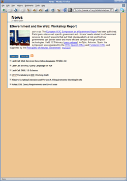
The collapsed text. (Click to see larger version.)

This picture shows what you will see when you open the page in a user agent that has JavaScript turned on. (See the HTML.) If JavaScript is turned off, you will see exactly what you saw before.


Updates to this post

2007-07-01: Moved cursor:pointer from rules for .triggerOpen and .triggerClosed to the rules for ā€˜.triggerOpen a, .triggerClosed aā€™. Stops the pointer appearing to the right of the trigger text. Also added note about <a> in trigger.

2007-06-05: Small change to CSS to ensure that the expand/collapse works when clicking on the + or ā€“ icon too. (Moved the padding.)

2007-04-18: Largely rewrote the text to make it more readable, and to take into account changes made to the JavaScript and CSS files (which incorporate the ideas from several comments below).

(Iā€™m making notes here so I can find these techniques again later.)

I wanted to use JavaScript (W3C DOM compliant) to wrap the content of a heading with an a element, ie.

<h3>This is <em>my</em> header</h3>

Needed to become

<h3><a href=ā€#mytargetā€>This is <em>my</em> header</a></h3>

Hereā€™s what I came up with:

var h = document.getElementBySomeMethod('h3'); // grab the heading
var a = document.createElement('a');       // create an a element
    a.setAttribute('href', '#mytarget');   // set the href
while (h.childNodes.length > 0) {          // for each child node in the h3
    a.appendChild( content.firstChild );   // move the node to the a element
    }
h.appendChild(anchor);                    // stick a under the now empty h3

It seems so simple now to look at. Took me ages to figure it out. šŸ™

You should always use the lang and/or xml:lang attributes in HTML or XHTML to identify the human language of the content so that applications such as voice browsers, style sheets, and the like can process that text. (See Declaring Language in XHTML and HTML for the details.)

You can override that language setting for a part of the document that is in a different language, eg. some French quotation in an English document, by using the same attribute(s) around the relevant bit of text.

Suppose you have some text that is not in any language, such as type samples, part numbers, perhaps program code. How would you say that this was no language in particular?

There are a number of possible approaches:

  1. A few years ago we introduced into the XML spec the idea that xml:lang=ā€ā€ conveys that ā€˜there is no language information availableā€™. (See 2.12 Language Identification)

  2. An alternative is to use the value ā€˜undā€™, for ā€˜undeterminedā€™.

  3. In the IANA Subtag Registry there is another tag, ā€˜zxxā€™, that means ā€˜No linguistic contentā€™. Perhaps this is a better choice. It has my vote at the moment.

xml:lang=ā€ā€ Is ā€˜no language information availableā€™ suitable to express ā€˜this is not a languageā€™? My feeling is not.

If it were appropriate, there are some other questions to be answered here. With HTML an empty string value for the lang or xml:lang attribute produces a validation error.

It seems to me that the validator should not produce an error for xml:lang=ā€ā€. It needs to be fixed.

Iā€™m not clear whether the HTML DTD supports an empty string value for lang. If so, the presumably the validator needs to be fixed. If not, then this is not a viable option, since youā€™d really want both lang and xml:lang to have the same values.

und Would the description ā€˜undeterminedā€™ fit this case, given that it is not a language at all? Again, it doesnā€™t seem right to me, since ā€˜undeterminedā€™ seems to suggest that it is a language of some sort, but weā€™re not sure which.

zxx This seems to be the right choice for me. It would produce no validation issues. The only issue is perhaps that itā€™s not terrible memorable.

This is an attempt to summarise and move forward some ideas in a thread on www-international@w3.org by Christophe Strobbe, Martin Duerst, Bjoern Hoermann and Tex Texin. I am sending this to that list once more.

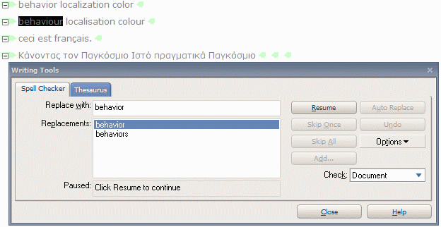
I use XMetal 4.6 for all my XHTML and XML authoring. As someone who has been advocating for some time that you should always declare the human language of your content when creating Web content, Iā€™m finding XMetalā€™s spell checker both exciting and frustrating. Here are a few tips that might help others.

The exciting part is that XMetal figures out which spell checker to use based on the xml:lang language declarations. Given the following code:

<html xml:lang="en-us" lang="en-us" ... > 
...
<p>behavior localization color</p>
<p>behaviour localisation colour</p>
<p xml:lang="fr" lang="fr">ceci est franƧais</p>
<p lang="gr" xml:lang="gr">ĪšĪ¬Ī½ĪæĪ½Ļ„Ī±Ļ‚ Ļ„ĪæĪ½ Ī Ī±Ī³ĪŗĻŒĻƒĪ¼Ī¹Īæ Ī™ĻƒĻ„ĻŒ Ļ€ĻĪ±Ī³Ī¼Ī±Ļ„Ī¹ĪŗĪ¬ Ī Ī±Ī³ĪŗĻŒĻƒĪ¼Ī¹Īæ</p>
...

The spell checker will recognize three errors (behaviour localisation colour). The en-us value in the html tag causes it to use the US-English spell check dictionary, and the fr and gr values in the last two paragraphs cause it to use a French and Greek dictionary, respectively, for the words in those elements. Great!

Picture of the spell checker in action.

Note that, since XMetal is an XML editor, rather than an HTML editor, it is the value in the xml:lang attribute rather than the one in the lang attribute that counts here. For XHTML 1.0 content served as text/html, of course, you should use both.

The following, however, are things you need to watch out for:

  1. If your html tag contains just xml:lang=ā€enā€ your spell checking wonā€™t be terribly effective, since all the English dictionaries (US, UK, Australia, and Canada) will be used. This means that for the code above you will receive no error notifications, since each spelling occurs in at least one dictionary.

    This is logical enough, though itā€™s something you may not think about when spell checking. (Even if you go into the spell checker options and set, say, the US English spell checker, the language declaration will override that manual choice.)

  2. If you want to write British English, you would normally put en-GB in the xml:lang (because thatā€™s what BCP 47 says you should do). Unfortunately this will produce no errors with our test case above! XMetal doesnā€™t recognise the GB subtag, and reverts to xml:lang=ā€enā€. To get the behaviour you are expecting you have to put en-UK in xml:lang. This is really bad. It means you are marking up your content incorrectly. Presumably the same holds true for other languages. I see CF for Canadian French, rather than CA, SD for Swiss German rather than CH, etc.

Itā€™s good to see that the language markup is being used for spell-checking. However, itā€™s a case of two steps forward, one step back. Which is a shame.

UPDATE: Justsystems have worked on this some more. See my later blog post for details.

Several times recently Iā€™ve needed to explain how I add gps information to my photos. I thought it would help to document it here. Iā€™m not saying this is the best way to do things, but it seems to work reasonably well.

Update (9 jul 2008): I have updated the Python script linked to near the end of this article.

If your browser window isnā€™t wide enough to show the right side of the pictures, just click on the picture to see the whole thing.

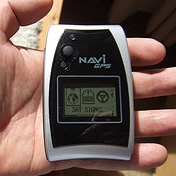
The NaviGPS device.

Plotting points while taking photos. I carry around a GPS device (NaviGPS) that plots points at intervals you can choose. I usually opt for every 5 seconds. The device is really light, small and waterproof. Main problems:

  1. Finding something to carry it in. I canā€™t seem to find the armband Scytex describes, and though carrying it in my trouser pocket worked reasonably well, I think it was sub-optimal. I recently acquired a small thin bag that clips onto my backpack or camera bag.
  2. Buildings can block the signal. This was an issue recently in the narrow streets of Oviedoā€™s old town. But itā€™s usually fine, and even in Oviedo produced usable results.
  3. Although the plots are usually incredibly accurate, there are occasions where parts of the track seems slightly displaced from the route you can see on Google Earth. I donā€™t know whether this is because Google Earth is slightly incorrect or the GPS points are slightly off. (See how I deal with that below.)

I also try to remember to synchronise, as GMT, the data/time in my camera with the date/time in the GPS device before I set off (although youā€™ll read later that I have a way of dealing with this if I forget).

Converting points to tracks. When I get back to my computer, it takes about 10 seconds to upload the data from the GPS device to a folder using a USB cable. The resulting file has a .nmea extension and contains information about latitude, longitude, elevation, etc, and a timestamp for each point plotted. (Example.)

I use a small Python script I wrote to convert that to a .kml file that can be viewed on Google Earth or Google Maps. (The code is given below.) The script takes about one second to run. The result is a line that joins all the ā€˜dotsā€™ together, and provides timestamp information and elevation data on the left of the screen for each 5-second plot that links to the the appropriate place on the map. (See the picture below.)

The program lets me add a positive or negative offset, in seconds, if I have forgotten to synch the camera and the gps device, and adjusts the times of the plots to match those on the photos.

See the example of this recent trip in Bhutan. The file at the end of that link is a particularly large file ā€“ 1.3Mb ā€“ since it contains annotations for 5-second plots over a period of around 12 hours. Usually my files are only a fraction of this size. (I often produce the track plot without the annotations. In this case, even this 12-hour file would only be about 248k.) Note: There is one long straight line in that plot ā€“ this was due to the GPS device being inadvertently turned off at one stage.

Adding geo data to my photos. After adding XMP data to my photos about location, title, etc, using Adobe CS2 Bridge, I also add latitude and longitude to the exif data using Picassa and Google Earth.

The beta version of Picassa allows you to add latitude and longitude to your photoā€™s exif data by visually locating a point on Google Earth.

Click to see the full picture.

Picture of the menu selection in Picassa.

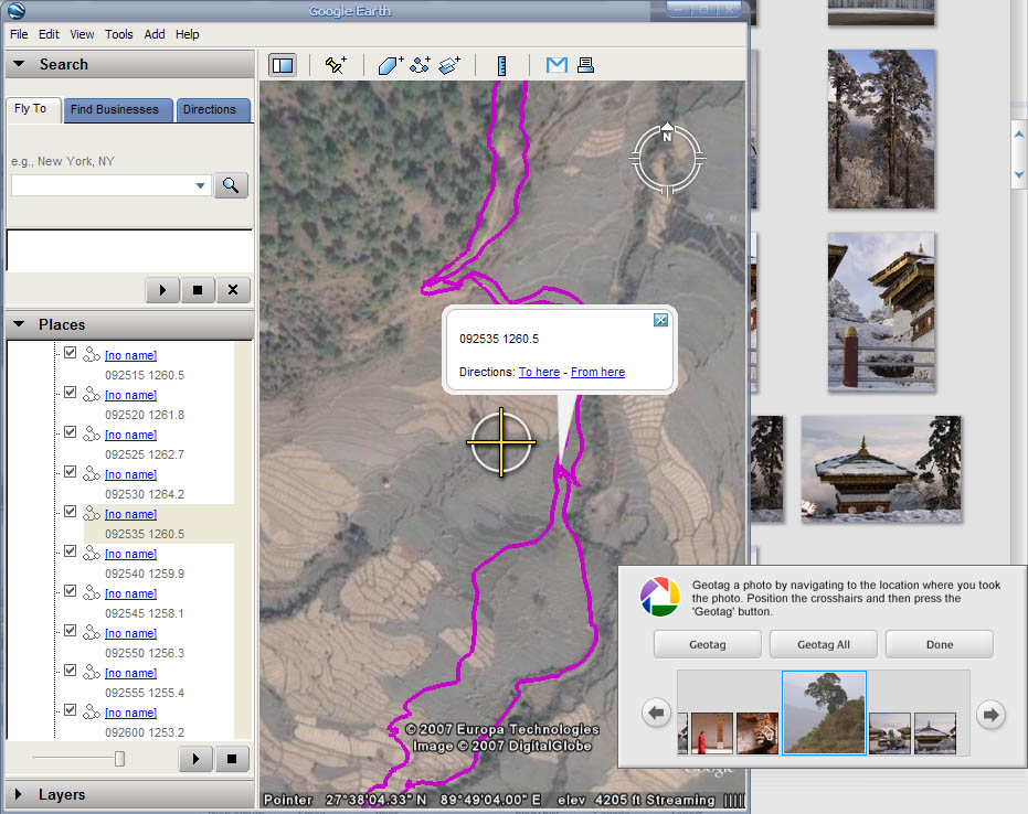
You can assign geodata for batches of photos or individual photos. You just line up the target icon with the right place on the map and hit the Geotag button. (See the picture below, showing me about to line up a location with the target icon.)

In principle, to find the right place on the map, I click on the nearest timestamp to the left (see 092535 in the picture below, which was the time in GMT when I took the photo of the tree, bottom right) to identify the position, and then move the map until that position is below the target. In practice, I can usually remember and see where I was standing relative to a given landmark or street corner, etc, and I move that under the target. If the GE definition is not high for that area however, I use the timestamp on the photo and the plot trace on Google Earth.

Where thereā€™s a discrepancy, I donā€™t know whether my gps plot or the Google Earth map is most correct, but I opt for the visual approach because when I use this data it is typically to show my location on Google Earth/Maps. So I try to sync to what I see (and cross my fingers that things wonā€™t change when GE rephotographs that location).

If I canā€™t tell within a (very) few metres where I was standing, I donā€™t geotag my photo.

Click to see the full picture.

Picture of Google Earth just before I position the map for a particular photo and hit the Geotag button.

The one fly in the ointment here is that I canā€™t use Picassa to tag my RAW files in this way ā€“ which is a pain, because using Adobe CS Iā€™m able to add all the other metadata I want. Iā€™m hoping Picassa may do something about this soon, or (perhaps even better for me) that Adobe will add similar capabilities to Picassa for tagging photos from Adobe Bridge with Google Earthā€¦ For now, I just get by as best I can.

Uploading the geodata. When I upload a photo to Flickr or Panoramio, the exif geodata is read automatically and used to establish the location on their maps.

Click to see the full picture.

Picture of a photo on Flickr showing how it locates the place the photo was taken on Yahoo maps.

Using the geodata. Once I have the geodata in the photoā€™s metadata, I can use it in a number of ways.

I can extract it to label a photo, as in this example (click on ā€˜show detailā€™). This has advantages such as: (a) a reader can easily get at the data, eg. to cut and paste the coordinates into Google Earth or Google Maps to see where the photo was taken, (b) if the copy of the photo itself no longer contains the metadata (as in this case), the data is still available. (Note: the full-sized version of the photo linked from that page does contain the exif data.)

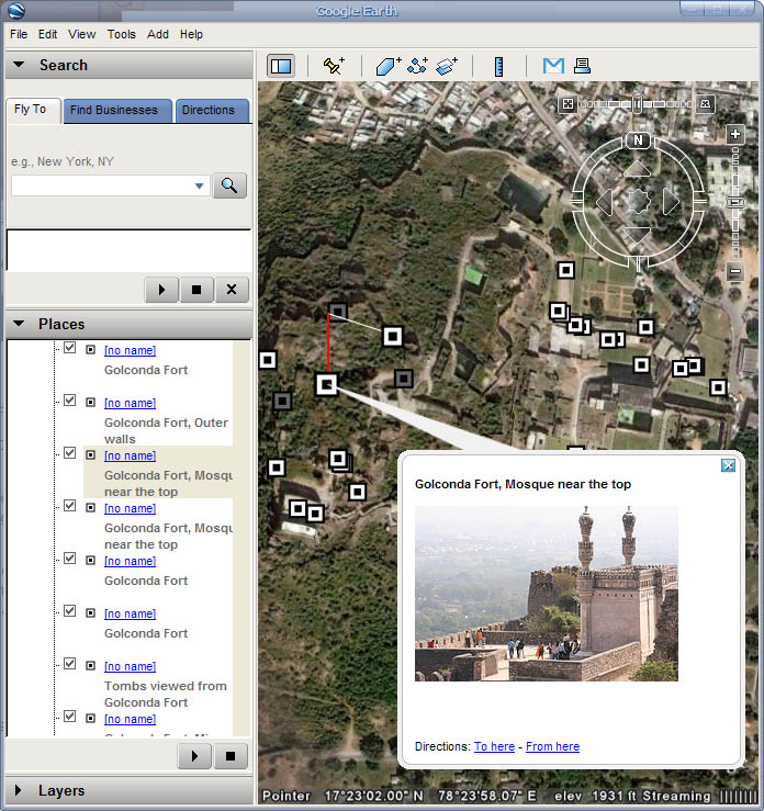
For my sets on Flickr, I also run some simple Python scripts to create a .kml file which shows the location of each photo on Google Earth or Google Maps. I just upload the .kml file to a server, and you can access the information from a simple HTML link. Try this example of photos taken at the Golconda Fort, Hyderabad, on either Google Earth or Google Maps. If you click on the icons you see on the map, you can see the view I had from that position.

Click to see the full picture.

A picture of a set of photos plotted on a map in Google Earth, showing how you can see a photo by clicking on an icon.

Python code.

This is the code I use to convert the .nmea data to an annotated .kml file. Before the script runs you are asked to input the name of the file to be converted and any offset needed (in seconds) to synchronise the camera time with the time in the gps device (this can be a positive or negative number or zero).

See the sample input (NMEA file) and sample output (KML file).

See the code (view the file or download and convert the extension to .py)

New picker

I finally got around to studying the Tibetan script. To help with that I created a Tibetan picker.

This picker includes all the characters in the Unicode Tibetan block.

The default shows all characters as images due to the rarity of Tibetan fonts. Consonants are mostly in a typical articulatory arrangement, with vowels below, and digits in keypad order.

Since characters cover the whole Tibetan block, there are many characters that are used for transcriptions rather than just the characters needed for ordinary Tibetan text. There are also many symbols, and three characters that are not in the Tibetan block itself. I tried to arrange things so that the most commonly used characters for Tibetan or Dzonkha are easy to get at, but Iā€™m open to suggestions.

Note that the Tibetan Machine Uni font I use as a default setting is an OpenType font that requires version 1.453.3665.0 or later of the Uniscribe engine (usp10.dll). So the output is not ideal in my browser. Works fine if you cut and paste into MS Word though. šŸ™

Enjoy.

Update:

I installed a later version of uniscribe, and now my Tibetan text looks fine in the browser as well as in Office. On my previous laptop I just used a small tool thatā€™s downloadable from the Tibetan & Himalayan Digital Library. My new laptop, however, didnā€™t work with that tool ā€“ Iā€™ve no idea why. So I had to resort to using the Windows Recovery Console.

Iā€™m already subscribed to Microsoft Volt, so I used the latest uniscribe version from there, dated 4 jan 2006.

Iā€™ve been lucky enough to have access to a pre-publication electronic version of the new Unicode Standard 5 book, and though Iā€™ve been terribly busy just lately, Iā€™ve carved out a little time to read and even use some of it. And I like what I see.

Iā€™ve always thought the Unicode book was a really useful thing to have if you need to understand the ins-and-outs of Unicode for implementation purposes, or if you are simply interested in how scripts work. It has always been relatively easy to read, and more like a guidebook than a standard, if you know what I mean. The good news is that that seems to be even more the case in the latest version. There are lots of small edits that improve the clarity of the text and make it more readable.

In simple terms, a grapheme cluster is a sequence of characters that need to be kept together for things like wrapping text at the end of a line, cursor movement, delete, etc.

There are, however, some more significant changes that are also very welcome. For example, Iā€™ve been looking at first-letter styling in CSS recently, particularly in the context of Indian scripts, but despite a lot of searching I was unable to figure out where the Standard actually told me that a default grapheme cluster didnā€™t cover a whole Indic syllable. The grapheme cluster concept is really quite an important one for implementations, and it was frustrating to see it described so poorly.

All that has changed with extensive additions to Chapter 3. Now section 3.6 Combination contains a substantial amount of new text that explains grapheme clusters quite clearly. Again, donā€™t be put off by the dour-sounding title for Chapter 3, Conformance. It contains lots of useful definitions and explanations in the typical clear and succinct style of the book.

I have to admit to a tinge of disappointment that the Standard Annexes which are now included in the book have simply been added as appendices, rather than integrated into the text proper. My evaluation copy didnā€™t actually contain this text, so I canā€™t comment further, however.

Also, I had decided a short while ago that I need to finally get to grips with Tibetan script, and some urgency has been added to that given that I will visit Bhutan in January. I was disappointed, therefore, to find that the section on Tibetan script had not been edited at all. That section has always been substandard, to my mind, in terms of clarity and writing style.

On the other hand, I see that useful additions have been made to existing block descriptions elsewhere (such as a useful additional section on Rendering of Thai Combining Marks in the Thai description). I see similar additions to block descriptions such as Lao, Gujarati and Gurmukhi, and the Bengali block description seems to have been largely rewritten. Iā€™m looking forward to getting my teeth into those and also the numerous, enticing new block descriptions, such as Phags-pa, Nā€™ko, Sumer-Akkadian (cuneiform) and the like.

So would I recommend it? Certainly. The Unicode Standard is a mine of useful and accessible information if, as I said, you are implementing Unicode-based applications or you are interested in how scripts work. And itā€™s worth replacing your previous version, not only because the new smaller format will make it much easier to handle and keep on your bookshelf, but because of the value of the many useful additions. Iā€™ll be picking up my copy at the Unicode Conference in Washington next month.

Start the app

This dynamic HTML app helps you convert between Unicode character numbers, characters, UTF-8 and UTF-16 code units in hex, percent escapes, and Numeric Character References (hex and decimal).

This new version adds some useful things:

  • You can now convert to and from percent escaped forms. When converting to percent escapes, characters allowed in URI syntax are not converted. When converting from percent escapes you can only use characters allowed in URIs.
  • You can also now convert from a mixture of characters and escapes in the bottom two fields.
Some people have construed this as an attack on IE7. It is absolutely not. Iā€™m trying to be helpful. Microsoft has always taken great care not to break things for their customers when releasing new browser versions. Iā€™m just trying point out an issue I think they may have missed. The title summarises the issue.

The IE7 blog just announced Microsoftā€™s intention to change the way browser preferences for Accept-language are set up by default. Basically your preferences will no longer, by default, be set to fr if youā€™re French, but to fr-FR instead, ie. your locale as determined by Windows settings.

I think this is going to cause major problems with content negotiation on the Web.

To give a practical example:
Set your language settings to just es-MX and/or es-ES and point your browser to this article on the W3C site (an article explaining how to set language preferences).

Youā€™ll get back the English version, even though thereā€™s a Spanish version there. Someone with es set in IE6, Opera or Firefox will see the Spanish version automatically ā€“ even if their preferences are es-MX then es.

This is down to the way language negotiation is done on the Apache server.

In the article linked to above we explain that ā€œSome of the server-side language selection mechanisms require an exact match to the Accept-Language header. If a document on the server is tagged as fr (French) then a request for a document matching fr-CH (Swiss French) will fail. To ensure success you should configure your browser to request both fr-CH and fr.ā€

This is from the Apache 2 documentation:

The server will also attempt to match language-subsets when no other match can be found. For example, if a client requests documents with the language en-GB for British English, the server is not normally allowed by the HTTP/1.1 standard to match that against a document that is marked as simply en. (Note that it is almost surely a configuration error to include en-GB and not en in the Accept-Language header, since it is very unlikely that a reader understands British English, but doesnā€™t understand English in general. Unfortunately, many current clients have default configurations that resemble this.)

Apache 2 introduces ā€œsome exceptions ā€¦ to the negotiation algorithm to allow graceful fallback when language negotiation fails to find a matchā€, but those using Apache 1 donā€™t have that luxury.

Apart from the fact that most users wouldnā€™t even know that they can set their browser preferences differently, not to mention knowing how to do that, IE7 CR1 doesnā€™t even provide a preset selection for es rather than es-ES ā€“ you have to enter it manually. Not likely to happen much.

It seems to me that a simple fix to this would be for IE7 to set the userā€™s default preferences to *also* include es (ie. es-ES, es for Spain, fr-FR, fr for France, etc.). Then, when a file such as qa-lang-priorities.fr-fr.html is not found, the server will find qa-lang-priorities.fr.html and return a French file. Those people who want to know where the userā€™s browser is (likely to be) physically located can still use the fr-FR information to get the locale.

I think that the result of ignoring this is that many people will be confused about why they no longer see a page in Spanish, when they did before, and a lot of hard work by content developers will go unnoticed on the Web. In short, think Microsoft is about to introduce a serious bug into IE7.

Note, in passing, that the rules for specifying the lang attribute in HTML and xml:lang in XHTML are described by BCP47. The latest syntax and matching specifications are RFC4646 and RFC4647 ā€“ which obsolete RFC 3066 and RFC 1766, and which tells you to go to the IANA Language Subtag Registry at http://www.iana.org/assignments/language-subtag-registry to find out what language codes to use, rather than the ISO code lists. For more information, see http://www.w3.org/International/articles/language-tags/ )

Btw, I tried posting this as a comment on the IE7 blog page, but it didnā€™t work (site busy) so I did it here.

I got an email this morning asking for some use cases for the CSS :lang selector. Here are some ideas. This should help content authors understand how using :lang can sometimes be better than other approaches when selecting content for styling. Of course, not all user agents support :lang, and hopefully these use cases will also show how enabling support could be useful.

Use case 1

One of the main cases where I want to use :lang is when I have a page that includes numerous short pieces of text in a different script. Take, for example, my notes on the Myanmar script. In such cases I want to assign a particular font and perhaps font-size, etc, to the numerous Myanmar examples.

It does my head in trying to ensure that I labelled all the myanmar text with class attributes so that I get the right font and colour applied. And itā€™s frustrating, because all Iā€™m doing is repeating information thatā€™s there already in the lang attribute (and in the xml:lang attribute too, given that this is xhtml).

Adding class="my" everywhere also bulks up the document. Even in this smallish document, it adds over 1K to the page size.

It would make life a lot easier to just include a single CSS rule:

:lang(my) { font-family: myanmar1, sans-serif; color:red; font-size: 130%; }

Use case 2

Suppose you have the following Japanese text in an English document:

<blockquote lang=ā€jaā€ xml:lang=ā€jaā€>ćƒÆćƒ¼ćƒ«ćƒ‰ćƒ»ćƒÆć‚¤ćƒ‰ćƒ»ć‚¦ć‚§ćƒƒćƒ–ć‚’<em>äø–ē•Œäø­</em>恫åŗƒć’ć¾ć—ć‚‡ć†</blockquote>

Now suppose you want to apply different emphasis styling to the Japanese text, since italicisation doesnā€™t work well for ideographic scripts in small font sizes. Letā€™s suppose we wanted to add the proposed wakiten emphasis style that CSS3 describes. How do you make that happen?

Well, ideally, youā€™d just add the following rule to your CSS, and all would be taken care of:

em:lang(ja) { font-emphasize: dot before; font-style: normal; }

(ā€œWhen you encounter an em tag and the language is Japanese use wakiten and remove the italics.ā€)

If youā€™re dealing with IE6 :lang is not supported, and youā€™d actually have to add a special class to each and every emphasis tag embedded in Japanese text and use a rule such as

em.ja { ... }

How annoying is that!

IE7 CR1 supports the CSS selectors lang |= and lang =. Aha! you might think, problem solved. We can use the following rule:

em[lang |= 'ja'] { ... }

But youā€™d be wrong. This only works if the language is declared on the em element itself. So youā€™d still have to go through and add lang="ja" xml:lang="ja" to each em element ā€“ even though you have already declared that the whole blockquote is in Japanese!

Use case 3

This use case is slightly less mainstream, but I think it presents a slightly different use case, but one which is increasingly common with the increase in multilingual blogs and AJAX powered pages. It applies when you include text into a page that comes from another environment, either by cut & paste, or by automatic means, and you donā€™t have the styling information that was associated with it originally.

Assuming that the text has language attributes, or that you can apply those, you could have a set of default rules in your environment that, say, apply a nastaliq font with a percentage size scaling factor to all text in Urdu, so that it has some styling at least, and is a reasonable size relative to the Latin text.

For example, if I cut and paste some Urdu text into this blog, it could make the difference between seeing this:
Text in English and Urdu without styling.

and this:
Text in English and Urdu with styling.

Adding, once, a couple of rules in your blog css that say:

:lang(ur) { font-family: standardMSUrdufont, standardMacUrdufont, standardUnixUrdufont, serif; font-size: 140%; }
em:lang(ur) { font-weight: bold; font-style: normal; }

would be preferable to having to add extra inline markup to the text as you add it to your blog each time.

As a similar example, I just released the latest version of the UniView tool (a kind of web-based Character Map on steroids). It includes a facility that allows you to write your own notes about characters in a separate document and see the relevant notes when looking up a specific character. The information is sucked in using AJAX features. See [1].

We do not at the moment try to incorporate/recognize the other documentā€™s style rules when the notes are displayed in UniView, however, while keeping things simple, it may be useful to allow the UniView user switch on or off some very general default style rules specifying fonts and/or font sizing to text marked up for a particular language.

As long as the code is marked up for language, such defaults can be applied regardless of what class names or styling appeared in the original document. Of course, :lang would be very useful in this respect.

[1] To see this example
a. open UniView
b. where it says ā€œSelect a range to displayā€ select Myanmar
c. click on character 1004 and see the description on the right
d. now click on the icon with a + sign between Notes: and Search string: fields
e. from the menu select Myanmar block and say ok, and dismiss the pop up
f. now click on character 1004 again, and see the notes added to the description on the right ā€“ these notes came from an XML file (see the same file served as xhtml)

(Anyone can write such a document, stick it on a server and include its information in UniView. The only requirement is that the notes you want to appear be surrounded by <div class=ā€notesā€ id=ā€C[hexCodepoint]ā€></div>. The example above is one such file supplied with UniView.)

Other useful stuff

At the W3C Internationalization site you can find:

  1. an article that answers the question: ā€œWhat is the most appropriate way to associate CSS styles with text in a particular language in a multilingual XHTML/HTML document?ā€œ
  2. a set of test pages relating to user agent support of :lang, lang|= and lang= and a fairly recent summary of results

New version

This is a major new release of UniView, bringing it up to date with the Unicode Standard version 5.0.0, but also improving the user interface and adding AJAX links to supplementary notes.

Changes:

  • Updated to support Unicode 5.0.0.
  • Restyled the menu panels, moving some less used functions to pop up windows to save on horizontal space.
  • Implemented an AJAX approach for incorporating notes files. This means that the page no longer has to be reloaded to add notes. It is now also possible to add more than one set of notes at a time. Note that these changes requires a small change to the markup of notes files ā€“ the div containing the notes for display has to have a class name ā€˜notesā€™ as well as the id for the character.
  • I added some bundled notes files ā€“ most notably myanmar. Note that these are subject to change on an ongoing basis.

Most of the properties display in the character-detail panel on the right are taken from the unicodedata file at the moment. I plan to incorporate additional property information over the coming months, but wanted to release this now so that you can get information about Unicode 5 characters sooner rather than later.