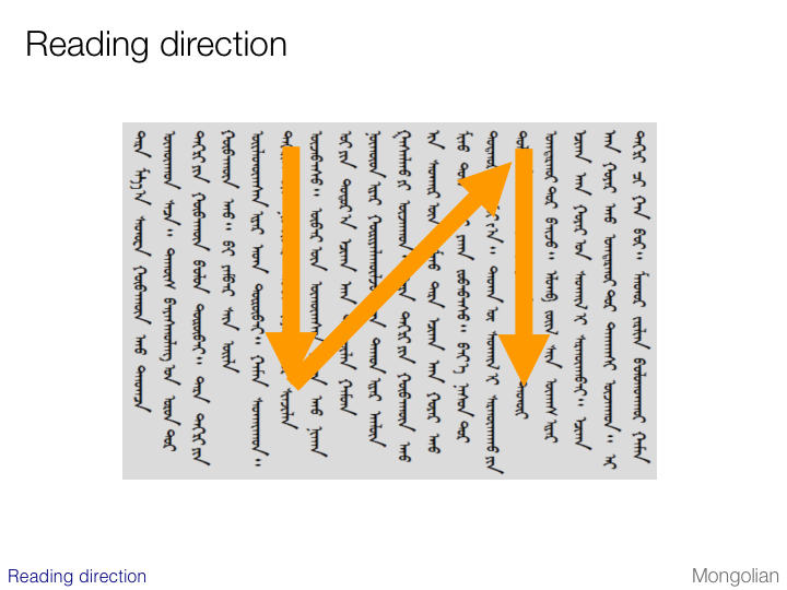
Vertical Mongolian lines are stacked from the left to the right of the page, but this is very unusual. Mongolian is also unusual in that it is only meant to be read vertically.
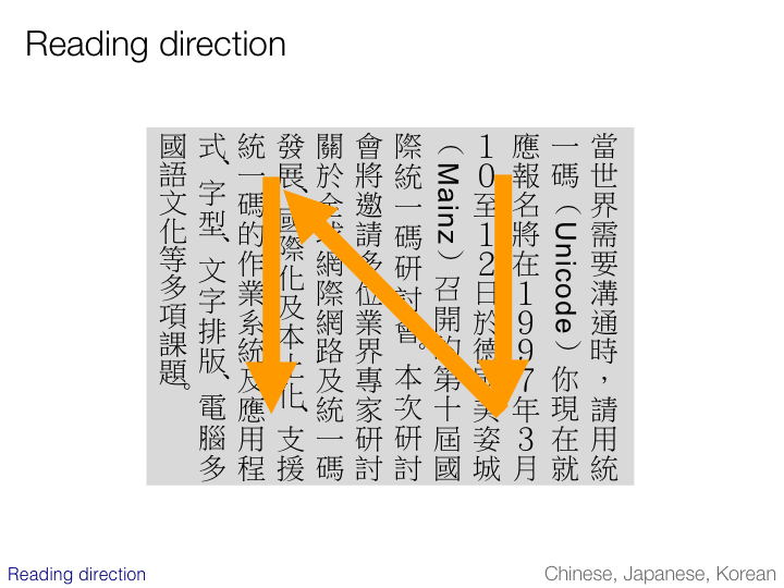
Lines in vertical Chinese, Japanese and Korean are stacked from the right to the left of the page. All of these scripts can also be set horizontally.
In Japan, vertically oriented text is still very common in printed matter such as books, magazines and newspapers. It is also quite common for Traditional Chinese. It is less common, but still found for Simplified Chinese and Korean text.
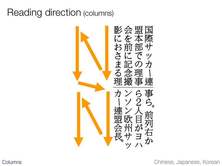
This slide illustrates the path of the eye in two-column vertical text. The columns, of course, run horizontally. If you are implementing an OCR application, this is an important thing to get right.
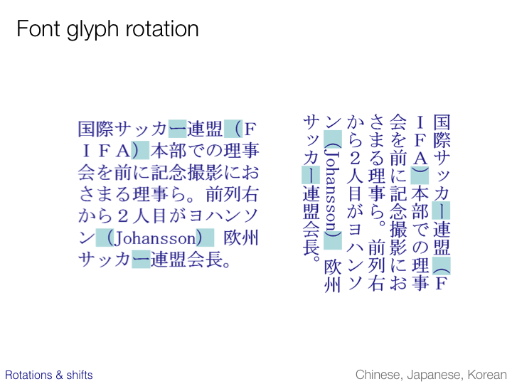
This and the two following slides show differences between the same text when set horizontally and vertically.
On this slide we see how parentheses and vowel lengthening marks are rotated. Bear in mind that this does not reflect any change in the underlying characters – the change is purely in the choice of glyph.
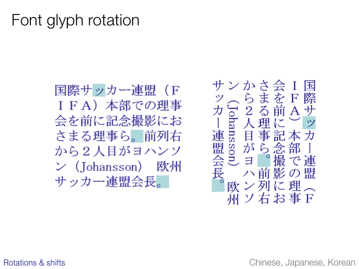
This slide shows how punctuation and small kana characters move from one corner of the cell square to the other. This is not a question of rotation.
This is not always an issue. In Chinese a period or a comma is typically centered in the character cell.
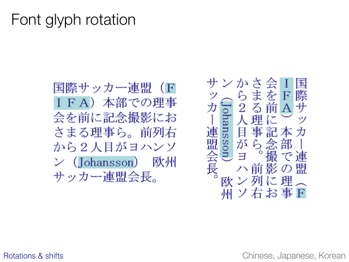
This slide shows the treatment of embedded Latin text. Text typically flows down the line at a 90 degree rotation from the East Asian characters, however acronyms and initials are commonly not rotated.
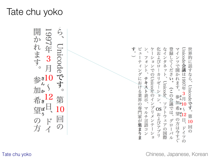
Vertical text often includes short runs of horizontal numbers or Latin text. In CSS this is referred to using the Japanese name tate chu yoko. It occurs in Chinese, Japanese and Korean vertical text.
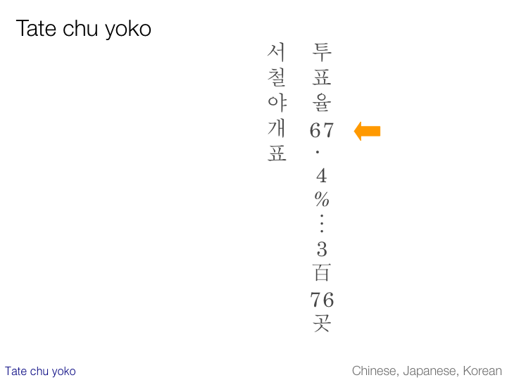
The example on this slide shows the heading of a newspaper article in Korean. It is rather an extreme case!
(Note also the use of a hanja character meaning ‘hundred’ between the 3 and the 76.)
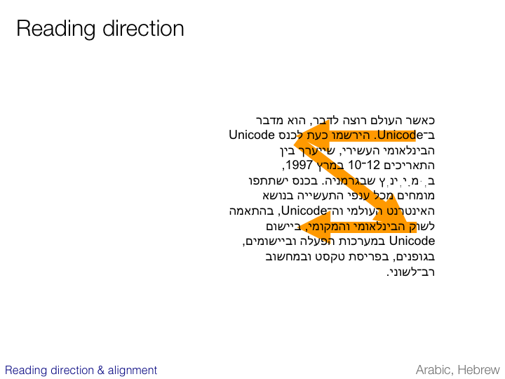
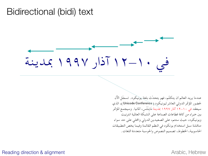
Arabic and Hebrew scripts run predominantly from right to left and are right justified.
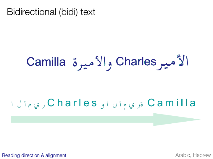
Text in right-to-left scripts does not always flow right to left. Embedded Latin text and all numbers are read left to right. It is for this reason that these scripts are referred to as bidirectional.
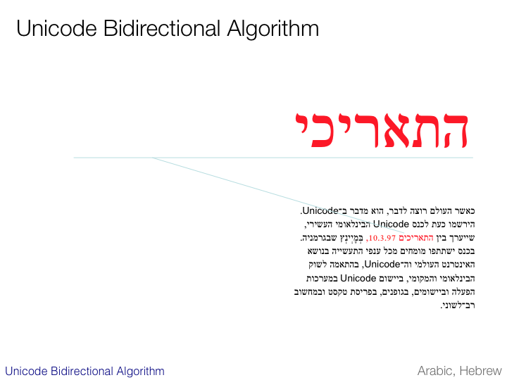
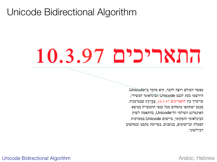
The slide illustrates the direction of the eye while reading the line containing a date.
Note that there may be slight differences between the Arabic and Hebrew approaches here. The Arabic for the dates ’10-12’ reads ’12-10’ – only the numbers flow left to right. In Hebrew it is likely that you would see ’10-12’ – the whole expression now runs left to right.
It is important to understand that the order of characters in memory is unidirectional, following what is called the logical order. The reordering you see on screen or paper is magic worked by the text rendering algorithms of the software.
The order in memory essentially follows the order in which the text is typed.
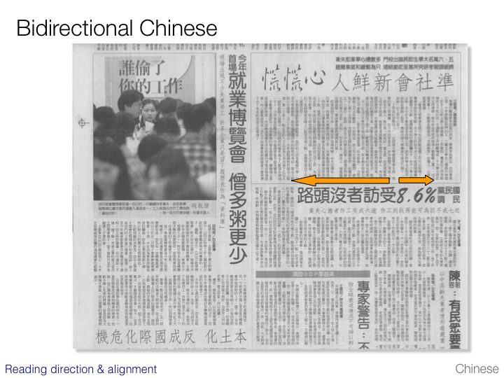
East Asian scripts often used to also be read from right to left, though this is much less common nowadays. The example shown on the slide is a Traditional Chinese newspaper where the text of the articles is predominantly vertical. The headings of the articles and the captions of the pictures run right to left. In this way the reading direction of the horizontal text is consistent with the flow of text in the surrounding articles.
Japanese text never does this any more. Even in newspapers containing vertically set text, the titles and captions always run left to right these days.
The Unicode Standard has a Bidirectional Algorithm that should be used to support the display of bidi text. Unlike many character sets, Unicode provides several properties of semantic information for every character. One of these properties indicates the behavior of the character with regard to inline directionality.
All Arabic and Hebrew letters have a directional type of right-to-left. Most other letters have a left-to-right type, including all numbers. Punctuation is typically directionally neutral, since its location depends on the context.
The next slide illustrates the use of this typing.
As each of the right-to-left typed characters are typed on the first and second lines the bidirectional algorithm will place the next character to the left of the previous one.
Because the numbers have a type of left-to-right, the 0 is automatically added to the right of the 1.
The punctuation relies on context to determine its position, so when it is initially entered the rendering algorithm assumes that it is a sentence-final period and part of the overall right-to-left flow. If a space and some more Hebrew characters was then input the period would remain there.
If, however, the next input character is a number, the rendering algorithm views the period as part of the left-to-right flow of the number, and moves it automatically to the right of the 10.
The bidirectional algorithm is somewhat more complicated than this in reality, but this helps you understand the basic idea.
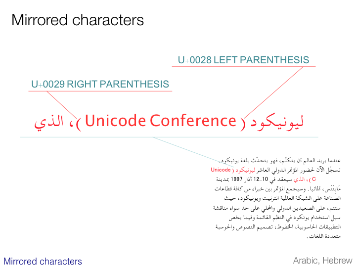
The treatment of paired characters such as parentheses deserves a brief mention here. The text on the slide flows consistently from right to left. The point of interest is the shape of the parentheses.
The first parenthesis encountered while reading – looks like ')' – is actually a LEFT PARENTHESIS, ie. in left-to-right text it looks like '('. The bidirectional algorithm expects the visual shape of such mirrored characters to be swapped when used in a right-to-left context. (In Unicode 1.0 the LEFT PARENTHESIS was actually referred to as OPENING PARENTHESIS.)
This approach facilitates the matching of character sequences across scripts.
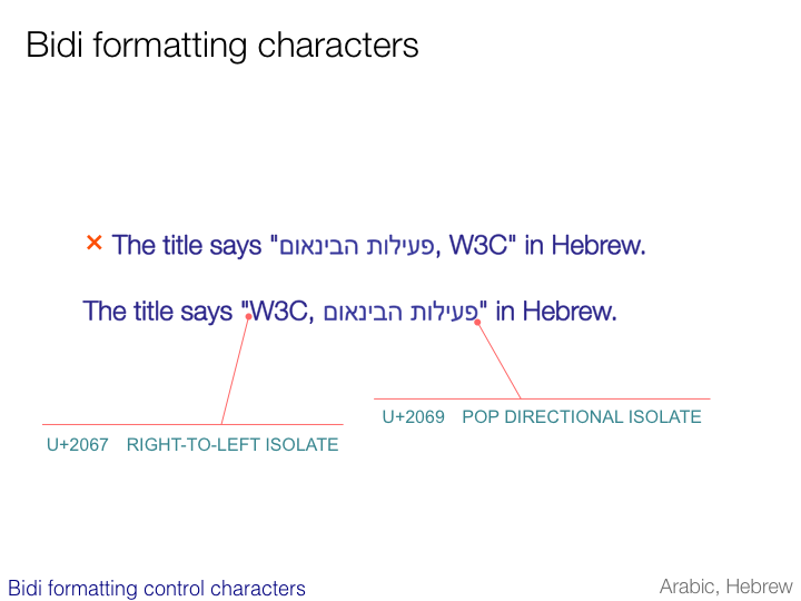
There are occasionally situations where the bidirectional algorithm needs a little help to determine the directional context.
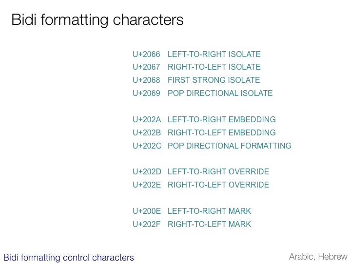
Unicode provides special, invisible control codes to help clarify such ambiguities or intentional deviations from the rules of the bidirectional algorithm.
The sample sentence preceded by the asterisk on the slide shows what you get if you rely solely on the bidirectional algorithm, due to the inherent ambiguity of the phrase.
By applying an embedding control character as shown in the view of the logical order of characters at the bottom of the slide, the correct result can be obtained (the middle line).
NOTE: Although these codes should do the job, in marked up text such as HTML and XML you should not use these control codes but use available markup instead (eg. the dir attribute in HTML).
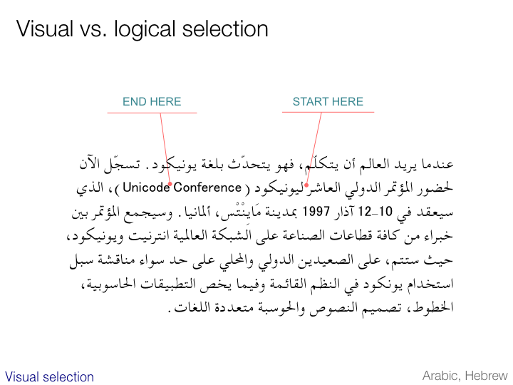
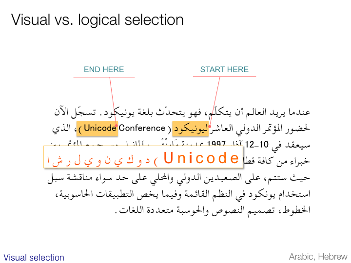
The difference between the logical, underlying order of bidirectional text and the displayed order of characters also has an impact on highlighting.
The next slide illustrates what may happen if you place your cursor at the point labeled “Start here” and extend your selection to the point marked “End here”.
As you can see here, two separate ranges of text have been highlighted, one of which falls outside the two points we mentioned on the previous slide. A look at the underlying codes (see the bottom of the slide) immediately reveals the inherent logic in this approach. Although this operation produced two visual selections, it produced only a single logical selection in memory.
It is also possible to find applications that would have produced a single visual highlight in this case. It is important to note, however, that this would represent two independent logical selections in memory.
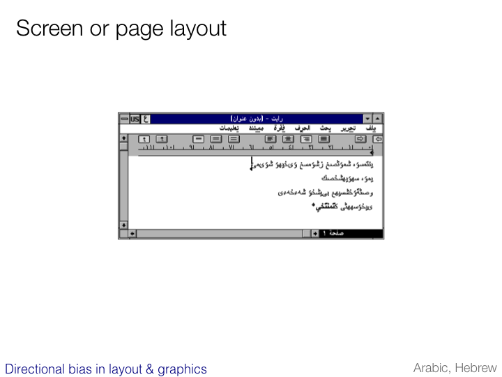
A predominant reading direction of right-to-left can have an impact on more than just the text.
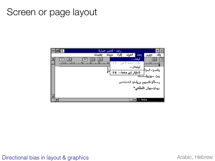
In Arabic and Hebrew environments the layout of screen information is typically mirrored to reflect the scanning direction of the text.
The screen shot of an editor on the slide shows the following differences from the English version:
the name of the application and that of the file are reversed in the title
the ‘File’ menu appears to the right and ‘Help’ appears to the left
the numbering on the ruler runs from right to left
the text is right aligned
the scrollbar appears to the left.
In addition, the text on pull down menus is on the right and accelerator keys are listed to the left.
If there were submenus they would cascade to the left, not the right as in an English user interface.
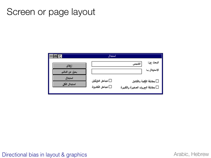
All the items on this dialogue box are mirrored by comparison to the English version.
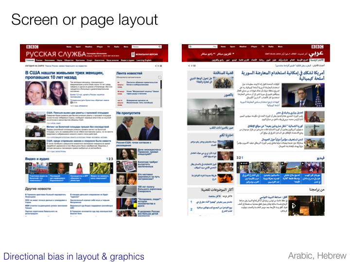
This slide illustrates mirroring of content on a Web page.
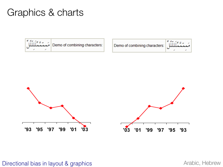
In addition to layout of user interfaces, directionality may affect the layout of charts, tables, spreadsheets, collated pictures, and the like. (This appears to more consistently the case for Arabic documents than for Hebrew.)
(It is worth visiting the Arabic or Hebrew sample page on the Web to see the effect of changing the directionality of the page on the table cells shown at the top of this slide. Just click on the button provided.)
Also, any graphics showing directional bias will need to be mirrored.
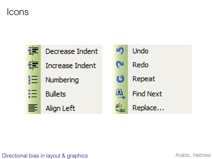
This slide shows a small selection of icons that exhibit directional bias and will probably need to be replaced with mirrored versions in an Arabic or Hebrew context.
Because Arabic and Hebrew documents run right to left, the turnover should appear to the left. The icons in the middle include directionality that is based on the assumed direction of text flow. The top right icon shows cascading windows, but on many Arabic or Hebrew platforms the windows cascade to the left. And the bottom right icon portrays a table, which as we saw on the previous slide would most likely be mirrored.
Note that the process of producing mirrored versions of these icons is fairly straightforward – just flip the graphic. This becomes more difficult if non-symmetrical letters have been used. (Although of course on another level, one could question the appropriateness of a Latin letter on an Arabic or Hebrew user interface.) In addition, the functionality associated with the undo and redo icons may require a relocation of icons, rather than a simple mirroring of the graphics.