An Introduction to Writing Systems & Unicode

Definitions

slide

Before starting this section it is important to draw attention to the difference between characters and glyphs.

A character is a semantic unit representing an indivisible unit of text in memory.

A glyph is the visual representation of a character or sequence of characters.

The example on the slide shows several glyphs for a single ASCII character, and two glyphs for a single character Han character. This distinction between glyphs and characters will become very important in this section. For more information about the distinction between characters and glyphs, see Unicode Technical Report #17.

A font, by the way, is a collection of glyphs.

 go to top of page

Combining characters

Arabic & Hebrew short vowels

slide

Arabic and Hebrew scripts usually do not represent short vowel sounds. The languages are so heavily pattern based that readers can adequately guess at the pronunciation of the words.

In circumstances where ambiguity appears, such as the name of the German town Mainz in the example on the slide, short vowels are represented as diacritics attached to the base consonants.

slide

Here, for example, the slide shows the Arabic word for engineer, pronounced ‘muhandis’.

It is actually written, ‘mhnds’.

slide

If needed, the short vowels (there are only 3 in Arabic) are represented as shown on the lower line of the slide. Note that the small circle diacritic indicates NO intervening vowel. (Sequences of code points in Arabic and Hebrew on this and following slides will be shown in left to right order, to emphasise that the underlying order is logical.)

These short vowels are separate combining characters in the text stream that are displayed in the same two-dimensional visual space with the base character. Combining characters do not generally appear without a base character.

 go to top of page

Context-sensitive placement

slide

When displaying combining characters, care has to be given to appropriate positioning. In the Thai example on the slide, the same character code is used to represent both of the tone mark glyphs that are circled. There are not two different characters based on the desired visual position. The font has to work out the best position for the glyph according to the run-time visual context.

slide

This slide provides another example of context-sensitive positioning of combining characters.

The short vowel ‘i’ in Arabic is usually drawn below the base character. This is normally the only way of distinguishing it from the short vowel ‘a’, which is displayed above the base character.

In this example, however, an additional shadda diacritic is introduced. The shadda is used to lengthen the consonant it is attached to. In that context it is common (though not mandatory) for the ‘i’ vowel diacritic to appear above the base character, but below the shadda so you can still tell it apart from ‘a’.

Note also that this example introduces the idea that you can have more than one combining character associated with a base character.

 go to top of page

slide

Here is another example of context-sensitive placement, this time in the indic script, Devanagari. The long U vowel sign, pointed to by the arrows, usually appears below the consonant (as shown on the right). However, after a RA (shown on the left), it may appear to the side of the consonant.

 go to top of page

Indic & South East Asian vowel signs

slide

In Indic scripts and scripts derived from them a consonant character carries with it an inherent vowel. The character on the top line on the slide is transcribed ‘ka’, not just ‘k’.

If you want to follow the ‘k’ sound with a different vowel, you append a vowel sign to the consonant character. This vowel sign overrides the inherent vowel with a different sound.

slide

In Indic scripts vowel signs are all combining characters. Unlike the Arabic and Hebrew short vowels, however, some of these combining characters may also take up additional space on a line (see the example ‘kiː’ on the slide). They are referred to as spacing combining characters.

slide

Thai, being derived from Indic scripts, also has vowel signs, although they are used in a slightly more complex way.

In the example on this slide, three vowel signs surround the consonant to produce the desired effect.

Whereas in the Indic scripts all vowel signs are combining characters, only one of the vowel signs in this example is combining. The other two (indicated by arrows) are normal spacing characters. This is a distinction introduced to Unicode at the request of the Thai national standards body.

This means that Thai follows a visual, rather than logical, model for positioning of some characters.

 go to top of page

Precomposed vs. decomposed

slide

There are many precomposed characters in Unicode that have an accent or diacritic already combined with a base character (such as a-acute above). It is however also possible to represent this character using a simple ‘a’ followed by a combining acute accent. This is referred to as a decomposed character sequence.

 go to top of page

slide

The Unicode Standard states that both of these approaches must be considered canonically equivalent.

 go to top of page

Coding combining characters

slide

When it comes to implementing combining characters, an important question to ask is what order should be applied to them and the base character. Unless you have agreement on this, you can have serious problems when passing data between systems.

The Unicode Standard requires that all combining characters follow the base consonant in a Unicode string. (So the example to the left on the slide is correct.)

slide

Each combining character has a combining class property expressed as a numeric value. Combining characters that appear in the same location relative to the base character when displayed will typically share the same combining class. For example acute, grave and circumflex accents all appear above the base character and all share the same combining class.

Multiple combining characters do not have to be in any particular order unless they are in one of the Unicode normalisation forms. The standard requires that sequences of combining characters should be treated as equivalent if they all have different combining classes.

Unicode normalisation, however, applies a canonical ordering to multiple combining characters.

If characters have the same combining class they are likely to interact typographically to produce different possible results, as in the case above. In this case the ‘inside-out’ rule is applied. This rule states that the proximity of the combining character in the text stream must match the visual proximity.

 go to top of page

Normalization

slide

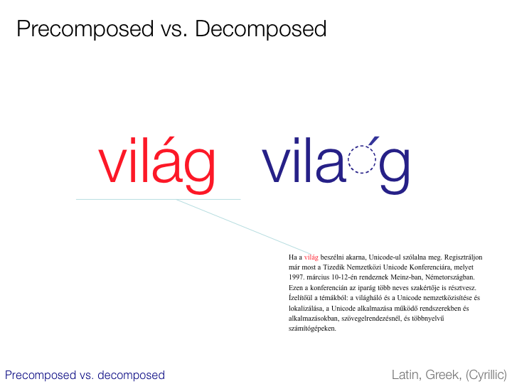
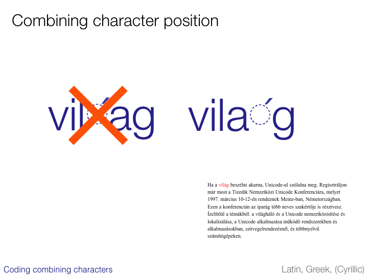
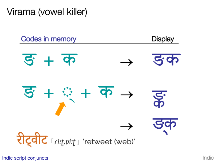
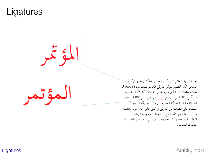
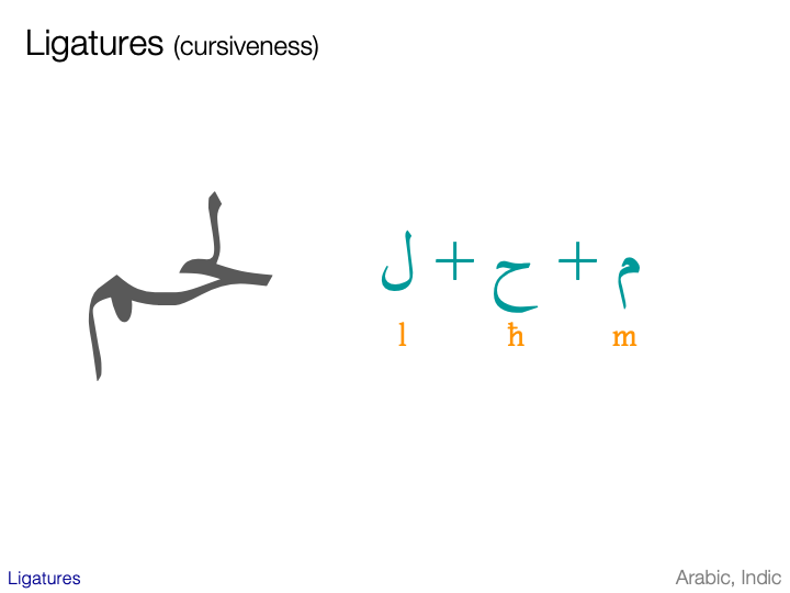
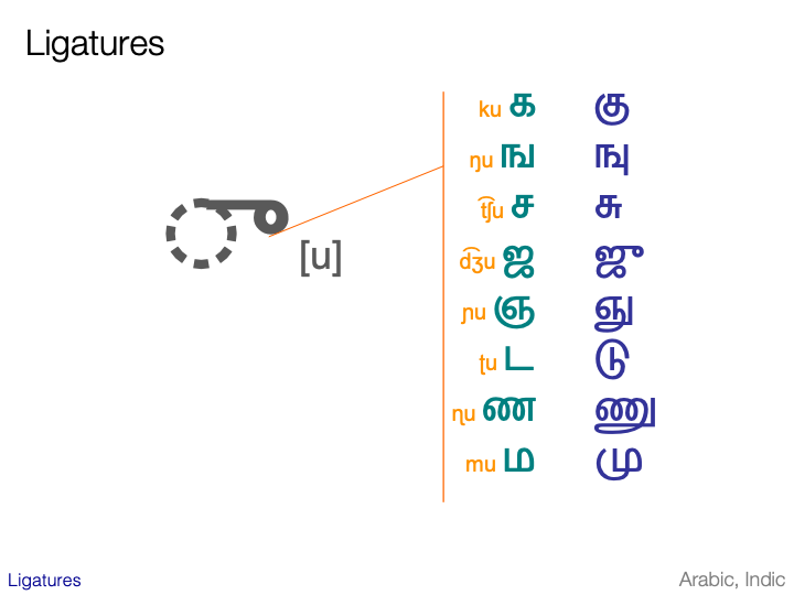
To facilitate the process of string comparison for operations such as searching, sorting and comparison it is helpful to adopt a standard policy with regard to precomposed versus decomposed variants of a character sequence, and the order in which multiple combining characters appear. 
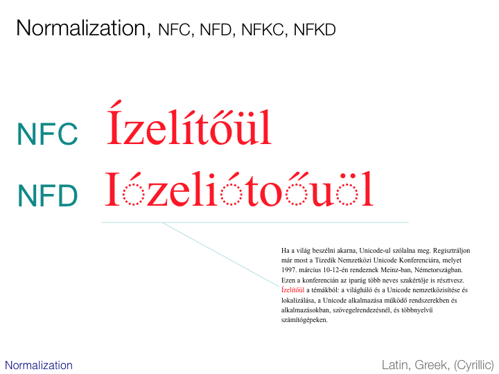
This can be achieved by applying an appropriate normalization form. The Unicode Standard provides a normalization form 
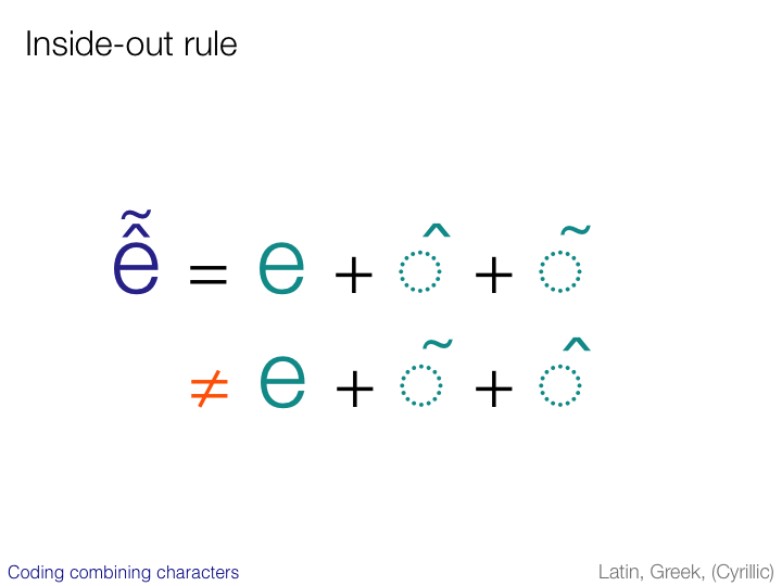
called NFD that represents all character sequences in maximally decomposed form. In addition to decomposition, NFD applies a standard order to multiple composing characters attached to a base character. As an alternative, the Unicode Standard offers NFC. NFC is achieved by applying NFD to the text, then re-composing characters for which precomposed forms exist in version 3.0 of the standard.

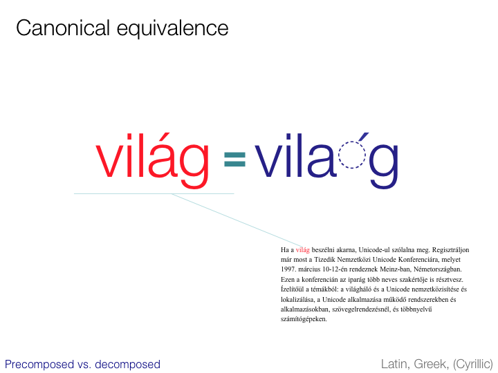
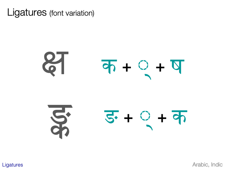
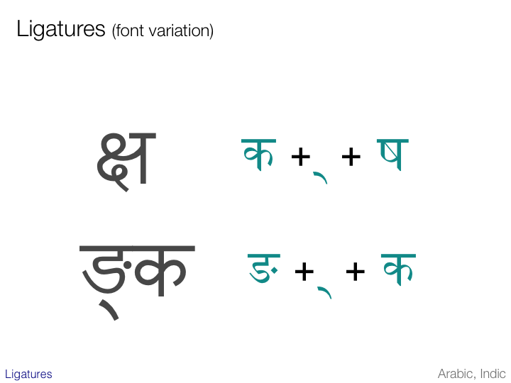
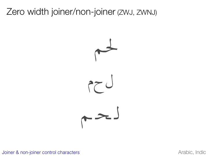
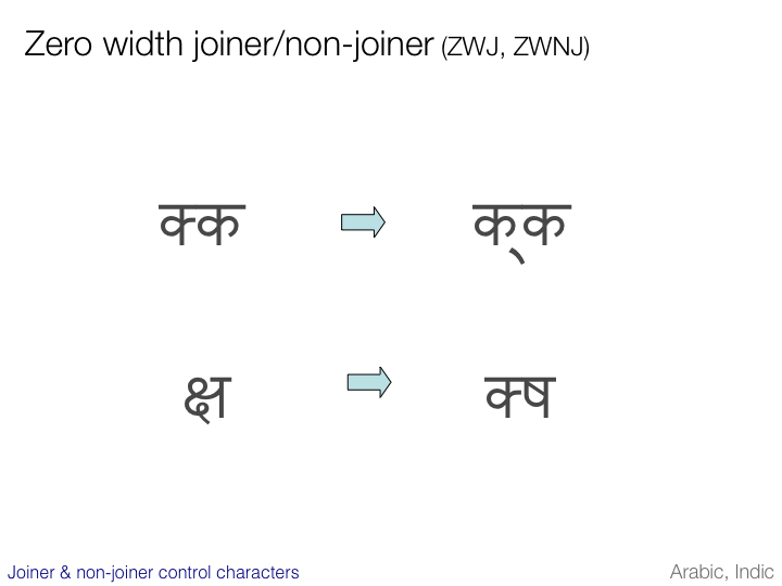
Note that there are actually some precomposed forms in the Unicode character set that are not generated by NFC, for reasons we will not go into here. In addition, where there is no precomposed form, a character sequence is left decomposed, but canonical ordering is still applied to all combining characters.

The Unicode Standard also offers two more normalization forms, NFKD and NFKC, where K stands for ‘kompatibility’. These forms are provided because the Unicode character set includes many characters merely to provide round-trip compatibility with other character sets. Such characters represent such things as glyph variants, shaped forms, alternative compositions, and so on, but can be represented by other ‘canonical’ versions of the character or characters already in Unicode. Ideally, such compatibility variants should not be used. The NFKD and NFKC normalization forms replace them with more appropriate characters or character sequences. (This, of course, can cause a problem if you intend to convert data back into its original encoding, because you lose the original information.)

 go to top of page

Cursive scripts

Word final glyph variants

slide

In Hebrew and Greek there are certain characters (only a small number) that look different in the middle of a word and at the end. Two examples are shown on the slide. In each example, the same consonant appears in the middle of a word and at the end of a word in the sample text, and has a different appearance.

Due to traditional approaches, these shapes are encoded separately and are typed in using distinct keys on the keyboard. This is manageable because there are so few such characters.

In other scripts a very different approach has to be taken.

 go to top of page

Cursive script

slide

Arabic is often referred to as a cursive script with the meaning that letters in a word are usually joined to each other – whether handwritten or printed.

The slide shows the unjoined form of the letter AIN at the top right, and, on the left, three joined examples of of the same letter. As you can see, the shape changes quite dramatically.

slide

This slide shows some more examples of un-joined Arabic letters (right column) and their various joining forms (to the left).

It is important to understand that there is only ONE code point here for each letter. The various different visual forms are only font-based glyphs chosen to suit the run-time visual context.

(There are compatibility characters encoded in Unicode for specific joining forms, but these should not be used for storing Arabic text edited in Unicode. They are only provided to allow round-trip conversions between Unicode and legacy character encodings. In Unicode normalized text these are all mapped to the main Unicode Arabic block.)

The shapes on the slide can be referred to (from right to left) as independent, initial, medial and final.

 go to top of page

Inputting cursive glyphs

slide

On previous slides we mentioned the ‘run-time’ context. This is quite important. If you type in the Arabic letter HEH shown at the top of the slide it will initially be in an independent glyph form. If you press exactly the same key on the keyboard and insert exactly the same character alongside it in memory, however, the original letter HEH will be expected to join with the second HEH. The shape of the first HEH will therefore change to ‘initial’, and the second HEH will be in ‘final’ shape. Type another HEH and the second will become ‘medial’, and so on.

In this way Arabic text is constantly changing as you type. The editing application also has to adapt these glyphs as you do things such as backspace, insert or delete text.

 go to top of page

Indic script consonant clusters

Conjunct consonants

slide

When two Indic consonants appear together without any intervening vowel sound they may form a conjunct, ie. the consonant cluster is rendered as a composite shape. This composite shape may show a vertical or horizontal mixture of the base shapes. In some cases the original constituents of a conjunct may not be recognizable.

One approach that is very common is the use of a half-form to represent the initial consonant in the cluster. An example of this is shown on the bottom line of the slide.

It is important to bear in mind, once again, that this is all glyph magic. The individual consonants are all still represented using the regular code points in memory, it is only the visual appearance that changes. There are no special code points for half-form glyphs. The alternate glyph appropriate for the context is simply applied at display time according to the rendering rules of the script.

slide

In fact, there is a vital ingredient to a conjunct form that we have not yet discussed. It has various script-specific names, but here we will use the generic term 'virama'. The virama is often also called ‘vowel killer’.

If you simply put two consonants side by side in Unicode, as in the top line on the slide, you will get two separate consonants displayed (with the assumption on the part of the reader that there is an inherent vowel between them).

It is only when you put a virama character between them that they combine to form a conjunct. So the conjunct glyph shown middle right actually represents three underlying characters.

The number of conjunct forms can vary from font to font. Some fonts will be capable of rendering more than others. So what happens if the font you are using doesn’t have a conjunct glyph for the combination you want to create? In such a case the virama is shown visually as a combining mark – see the last line on the slide. (In fact, in modern Tamil this is the default approach.)

 go to top of page

Context-sensitive shaping

Special joining forms

slide

The concepts we have discussed so far in this section on combining characters and glyph shaping have shown that there is no one-to-one correspondence, as there usually is in English, between the characters in memory and the glyphs displayed on screen. Indeed, sometimes complex rules are needed to determine the displayed result.

We have seen some of the more basic transformation cases, but over the next few slides we will take a quick look at some additional possibilities. This is by no means intended to give you all the information you need to implement these scripts – merely expose you to some slightly more advanced behavior.

Half-form glyphs in Indic scripts express the absence of a following vowel. This is a systematic and functional use of special shaping forms. The variation in shape carries a meaning to the reader.

 go to top of page

slide

In complex scripts it is common to find variations in glyph shape for the same underlying character, depending on the context in which the character appears. In this slide, the difference occurs for practical reasons: the underlying base character is wider in one case than the other, and the glyph that reaches over it has to therefore be slightly wider also.

 go to top of page

slide

This slide shows similar changes in the Myanmar (Burmese) script, as the vowel sign changes shape to fit with the glyphs in the remainder of the syllable.

 go to top of page

slide

Still with the Myanmar script, we see in this slide how the Burmese 'asat' combining character changes shape when associated with a tall base character.

The important thing to remember, in all of these cases, is that there is no change to the underlying characters in use. There is only one asat character, and the shape used to display it is picked from the font's repertoire of glyphs at run time according to rules encoded in the font. The font, therefore, has many more glyphs than there are characters in the script.

 go to top of page

slide

There are also some font-dependent alternatives for joining Arabic glyphs. Arabic glyphs typically join along the baseline, but in some (typically more classical) fonts, specific pairings join above the baseline as shown in the example on the slide. Since this is font dependent, it is driven more by aesthetics than by practical or functional motives.

slide

Arabic can take these special joining forms much further. This slide shows the kinds of special joining forms you will see in an advanced Arabic font.

On the top line we see the same character (U+0646 ARABIC LETTER NOON) in word-initial position and followed by 5 different letter sequences. Notice how the initial letter assumes a wide variety of shapes along with the following letter.

The middle line shows 3 items, each of which consists of the same character repeated twice. You can see that, although it is the same character, the glyphs are different.

And the bottom line shows how certain combinations can join vertically, rather than just moving along the baseline.

Positional variation

slide

Spacing combining characters to the left of the base consonant are common in Indic scripts. Here what is important to bear in mind is that the Unicode rule about combining characters following the base character still applies. It is only as part of the rendering process that the glyph for the combining character is made to appear to the left.

The red example on this slide shows how the Hindi word for ‘Delhi’ would normally be displayed, but the line just above shows the order of the characters in memory.

slide

The example text from the Thai sample shown on this slide illustrates the same effect in Thai. This word is pronounced very much like ‘program’, and the vowel sign at the far left is actually pronounced after the third character (ie. it is the ‘o’ sound after ‘pr’).

We have already seen, however, that vowel signs are not necessarily combining in Thai, so no reordering is actually needed in this case. The characters displayed are actually stored in the same order in memory.

slide
slide

This slide shows some additional examples of reordering during display.

The top example shows a single Tamil code point which is a combining character that places glyphs on both sides of the base consonant when displayed.

The bottom example shows the Devanagari repha in a consonant cluster. The RA code that appears at the beginning of the cluster in memory is rendered as a diacritic above the vowel sign that completes the syllabic cluster.

 go to top of page

Ligatures

slide

Ligatures are very common. In font terms, a ligature is a single glyph that represents more than one underlying character.

The example shown here is of a mandatory ligature in Arabic. A LAM character followed by an ALEPH character must always be displayed as a single lam-alef shape. Note carefully, however, that you should continue to use two characters in memory to represent this sequence: a LAM and an ALEPH.

In fact, while some fonts represent lam-alif using a single ligature glyph, others combine smaller partial glyphs to achieve the same effect. We will use the term 'ligature' here is a very loose sense to mean a combination of characters that are displayed as what, to the reader, looks like a single shape.

slide

This slide shows a word with and without some additional ligated forms in Arabic.

slide

This slide shows an Arabic word that contains a ligature of the first two letters. This ligature is optional and will only be displayed if the font developers included it. In other words, the number of ligatures available will generally vary with the font being used.

What is particularly worth noting here is that ligatures in Arabic also have joining forms when they occur alongside other characters.

slide

This slide shows some ligatures used to render Indic consonant clusters.

slide

Again, the number of ligatures available in a font varies. In some fonts the lower example may simply be rendered using a visible virama.

slide

Ligatures are not only used for combining consonants. This slide shows the effect of combining a single vowel sign with various consonants in Tamil. As you can see, the combinations produced some complex and vary varied results.

 go to top of page

Joiner & non-joiner control characters

slide

We have seen how Arabic glyphs join up with each other when juxtaposed. Unicode provides some special characters, invisible to the naked eye and to processing algorithms, to help control joining behaviour manually.

The zero-width non-joiner character (U+200C) can be inserted between the three characters LHM to create the effect on the second line. Here the three characters are not separated by spaces, but the glyphs no longer join.

The zero-width joiner character (U+200D), on the other hand, has the opposite effect. The three characters on the third line have spaces between them, but the joiner character is used to produce the joining forms of the glyphs. This behaviour is occasionally needed for correctly rendering Arabic text.

slide

Unicode allows you to force a consonant + virama sequence to display the virama where the font would otherwise have used a half-form – add a zero width non-joiner immediately after the virama of the dead consonant.

Unicode allows you to force a dead consonant to assume a half-form rather than combine as part of a ligature – place a zero width joiner immediately after the virama.

 go to top of page

Grapheme clusters

slide

What a user thinks of as a "character"—a basic unit of a writing system for a language—may not be just a single Unicode code point. Instead, that basic unit may be made up of multiple Unicode code points. This called a user-perceived character. The a-acute shown on the slide it is typically thought of as a single character by users, yet it may actually be represented by two Unicode code points. It is still expected to behave in many editing or typographic situations as a single unit.

slide

These user-perceived characters are approximated by what is called a grapheme cluster, which can be determined programmatically.

Unicode Standard Annex #29 says:

"Grapheme cluster boundaries are important for collation, regular expressions, UI interactions (such as mouse selection, arrow key movement, backspacing), segmentation for vertical text, identification of boundaries for first-letter styling, and counting “character” positions within text. Word boundaries, line boundaries, and sentence boundaries should not occur within a grapheme cluster: in other words, a grapheme cluster should be an atomic unit with respect to the process of determining these other boundaries."
slide

The definition of grapheme cluster was expanded in 2008 to cover some additional combinations. If your application stills follows the old model, it works with what are now called legacy grapheme clusters. The new version (which subsumes and extends legacy grapheme clusters) is referred to as extended grapheme clusters.

The current definition of grapheme cluster incorporates accented characters and other combining characters, including spacing combining characters. It also includes some other characters. Significantly, it doesn't include non-combining characters used for Thai vowel signs.

slide

The top line of the slide shows a Tamil word, split into 3 grapheme clusters: (1) a base character with a combining vowel-sign to its left, (2) a ligated base character and vowel-sign, and (3) a base character with a combining character above.

The Thai word on the second line is split into 6 grapheme clusters: (1) and (2) are a base consonant followed by a vowel-sign, but the vowel-sign is a non-combining character, so these are both separate graphemes; (3) is a consonant with an inherent vowel; (4) is a base consonant followed by two combining characters, one of which is composed of two parts, the second of which extends the cluster horizontally. Items (5) and (6) are a single consonant+inherent vowel, and a consonant with combining vowel-sign above, respectively.

slide

There are still some combinations of glyphs that users may consider a single unit, but which are not currently covered by the concept of grapheme cluster. Some Indic languages other than Tamil have groupings of glyphs that interact in a complicated way to create a single unit. In the word on the slide, the first syllable includes a consonant + virama + consonant + vowel sign. It is clear that this is a single typographic unit, not only because the first consonant uses the half glyph common to such conjuncts, but because the vowel-sign appears to the left of the whole group, and extends over to the rightmost part.

However, although this is one grapheme (ie. user-perceived unit), the Unicode grapheme cluster algorithm treats this as two grapheme clusters, where the first (the brown one) is embedded inside the second, visually. This is because the algorithm doesn't combine the characters following the virama.

UAX #29 describes the notion of tailored grapheme clusters for this. The problem is that such a combination of characters is not always rendered in way that looks like a single character – sometimes a virama may be used, rather than a ligature. So tailorings for conjuncts may need to be script-, language-, font-, or context-specific to be useful.

 go to top of page

First published Feb 2003. This version 2021-12-10 17:16 GMT.  •  Copyright r12a@w3.org. Licence CC-By.